Imagine that you come to a store near your home, and there is complete chaos there – things are scattered all over the place, there is a huge queue at the cash register, and the sales clerks cannot answer basic questions. It is unlikely that you will want to buy something in such a place. The same applies to trading on the Internet. If a store’s website is inconvenient to use, people leave for competitors without even getting to the point of placing an order.
According to statistics, almost 70% of potential customers abandon the shopping cart. The reasons may be different, but one of the main reasons is poor usability of the online store. People come to you with a specific goal – to find the product they need and order it without red tape. If something slows down, the navigation is confusing, and the design causes distrust – it will be easier for a person to close the page than to wait and figure it out.
To prevent this from happening, you will have to constantly work on improving the behavioral factors on the site. To do this, the Internet has a lot of ways to collect information and analyze the behavior of visitors. Use them to eliminate problems on the site and make the shopping process as easy and pleasant as possible.
What is usability of an online store website?
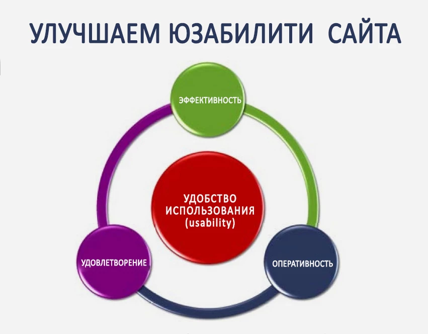
Usability of an online store is a set of factors that determine how convenient and pleasant it is to work with an online resource. The goal of usability is to shorten the buyer’s path from the first acquaintance with the site to making a purchase, making it as logical and comfortable as possible.
If a customer can easily navigate the catalog, find the products he is looking for, get comprehensive information about them and place an order without unnecessary obstacles, then everything is fine with usability. But if the navigation is confusing, filters work incorrectly, product cards are uninformative, and the checkout process takes many steps – get ready for visitors to leave for competitors.
So don’t underestimate the importance of usability. Every element of the site must work to bring people to the target action. Test, analyze visitor behavior, eliminate bottlenecks – and conversion will definitely increase.
Typical mistakes in online store usability (checklist)
As strange as it may sound, but even big market players often make the same mistakes in online store usability. Next, let’s break down the most common ones and make a checklist to help keep your site in good shape.
Low loading speed
Imagine yourself in the shoes of a potential customer. He went to the site for shopping, but instead of the product page he sees a rotating loading circle. 3, 5, 10 seconds pass – and the site is still not ready. Do you think the visitor will wait or go to a competitor?
Slow loading speed is not just an inconvenience. It’s a direct hit to sales and reputation. Studies show that every extra second of waiting reduces visitor satisfaction by 16% and increases bounce rate by 7%. E-commerce giants are well aware of this. For example, Amazon estimates that a second’s delay could cost them $1.6 billion dollars in lost revenue per year!
So why do websites still load slowly? The reasons are usually trivial – heavy and unoptimized images, cumbersome code, an abundance of unnecessary scripts or simply bad hosting. Fortunately, all of this can be fixed.
First, optimize your graphics: use modern formats like WebP, load new images as the page scrolls, compress images while maintaining quality. Then take care of the code – reduce the number of unimportant requests, remove unneeded libraries, activate caching. And don’t forget about reliable hosting using modern SSD disks.
No site search
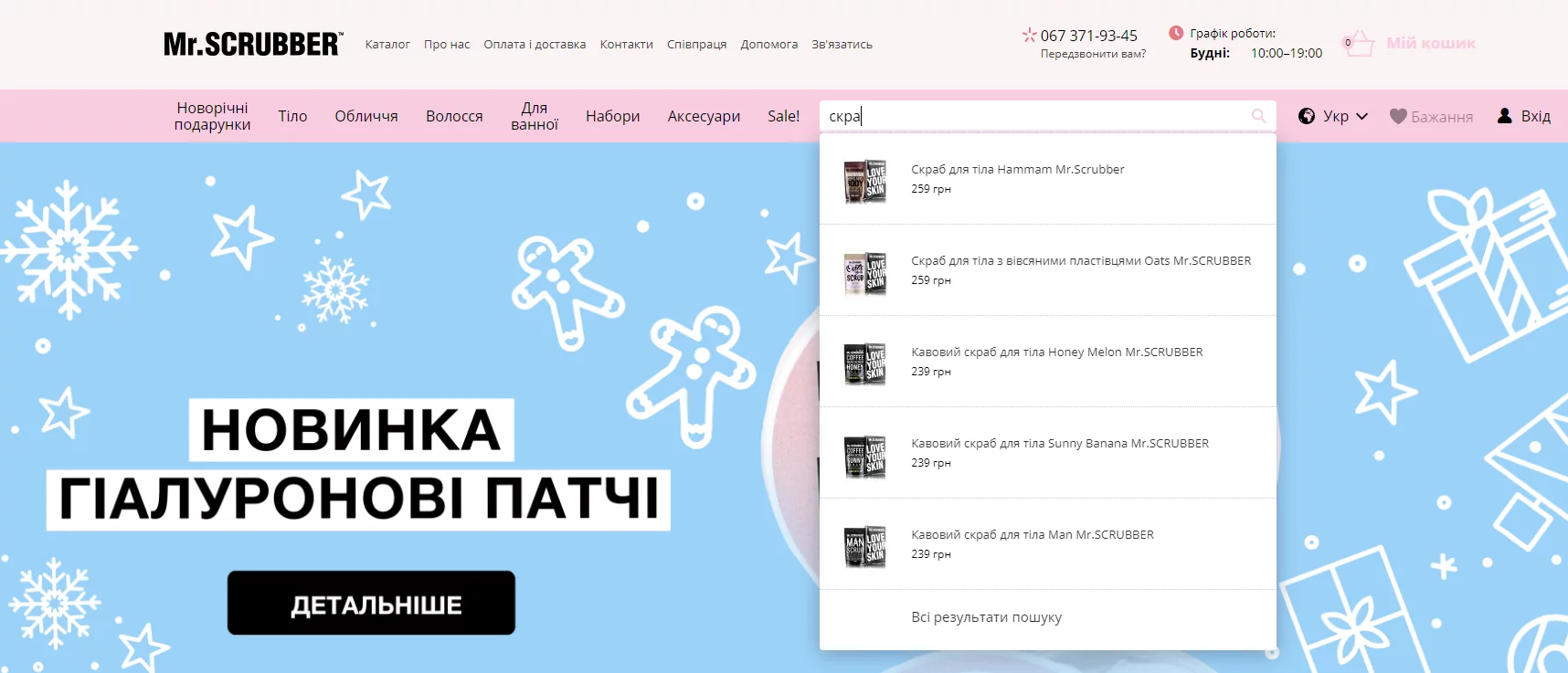
If you have a large assortment of products on your website, a convenient search is not a whim, but a necessity. Even with perfect navigation, people will prefer to type in a query and immediately see suitable products. Especially since they don’t always remember the exact model number or understand the categories.
But it is not enough just to place a search box in the header. The search must be “smart” and adapt to a fuzzy query. For example, a person searches for “Xiaomi TV”, but there are zero results in the output. Although there is a whole section with Xiaomi products in the catalog. The search logic should take into account typos, understand synonyms and provide hints when entering a query.
No contact information
When a customer visits a website, the first thing they often look for is contact information to make sure the seller is reliable. But instead all they see is an e-mail address and a feedback form. No address, no phone number, no link to social network profiles.
Most likely, he will have doubts: are they not scammers? Would you trust such a store with your money? To prevent your customers from going to your competitors, make sure that your contact page has:
- Physical address of the office and delivery points (if any) with a travel map. This confirms that the company really exists.
- Phones to contact managers or the hotline. The opportunity to talk to a live person increases trust.
- Schedule of office and delivery points. The client will know when he can contact you.
- Details of the legal entity. This further emphasizes the reliability of the business and can be used for non-cash payments.
Place the main phone number and the online chat icon in a prominent place so that the buyer can contact you quickly. It is better to put detailed contact information on a separate page. It will also be useful to add links to the company’s accounts in popular social networks.
No “Delivery and payment” section
Perhaps a person has already added an order to the cart, started to checkout and suddenly realized that there is no word on the site about shipping and payment. Immediately a lot of questions arise:
- Is there delivery to my city?
- How much will I have to pay for it?
- What are the payment options?
- How long do I have to wait for my order?
- And what if the product doesn’t fit, will it be possible to return it?
Failing to find answers, many people decide not to risk it and look for another store. It is especially disappointing when the customer finds out after the checkout that there are no deliveries to his region. This is a sure way for you to get a bad review and ruin your reputation.
To avoid such problems, make sure that your site has a “Shipping and Payment” section that contains:
- A detailed list of regions and cities where you ship goods. If the geography has to be limited, it is better to inform about it at once.
- A description of the delivery methods available (courier, postal service, delivery points) with an indication of the time and cost for different regions. Let people see at a glance how much it will cost to purchase the products, taking into account their transportation.
- A list of possible payment options (cash, bank cards, e-wallets, etc.). The wider the choice – the better.
- Information about warranties and return policies. Provide a clear understanding of what to do if the product you receive does not fit or is defective.
- Answers to the most common questions. By collecting FAQs on this topic, you will save yourself some of the routine support requests.
Place a link to this section in the site header, main menu or footer so that it can be accessed from any page. Make the text simple and clear, break it into paragraphs with subheadings – so it will be easier to read.
Unable to place an order without registration
Mandatory registration when placing an order is a serious barrier for many people. Some don’t want to spend time filling out forms, others are afraid to leave their data.
Of course, customer data is necessary for efficient work. But it is better not to shift the solution of your business tasks onto the shoulders of the customers themselves, creating inconveniences for them. Your main task is to motivate the visitor to place an order. And if he is ready to do it – don’t hinder him with unnecessary requirements!
What can be done:
- Allow ordering without registration. An unregistered visitor should be able to fully complete and pay for the purchase. At the same time, you can offer to register an account on the site after confirming the order.
- Simplify registration. If you can’t do without it, make it as simple as possible. Leave only the most necessary fields, minimize the number of clicks, add the ability to log in via Google or Facebook.
- Show the benefits of registration. Explain to people what bonuses they will receive – cumulative discounts, special offers, tracking of purchase history in a personal account, etc. Give customers a good reason to spend time on registration.
Little product data
Online store owners often underestimate the importance of having detailed information in the product card. Beautiful photos and rave reviews are great, but without detailed product characteristics they are clearly not enough.
In the product card must necessarily be:
- Detailed description: size, color, materials, equipment, country of manufacture. The more details – the better. There should be no questions left for the buyer.
- High-quality photos from different angles, possibly a video. Give the opportunity to consider the product from all sides.
- Reviews of real buyers with photos. They increase confidence and help you make a decision to buy.
- Information on availability, terms and delivery methods.
- Clear terms of payment, exchange and return. Clearly explain what to do if the product does not fit.
By the way, a competent description – this is also a way to raise the site in the search engine. Include in your texts key phrases for which your products are searched. This will improve your store’s visibility in Google searches.
Poor quality photos
Unlike offline stores, a customer on the Internet does not have the opportunity to evaluate a product in person. Therefore, the quality of photos and videos directly affects sales. Faded, fuzzy photos with extraneous objects in the frame are a sure way to drive away customers. In 2025, such photos only cause distrust and a desire to close the tab.
Here’s how you can solve the problem:
- Use 5-7 high-resolution photos on a neutral background. Show the product from different angles.
- Add macro shots of details: seams, hardware, texture. Give an opportunity to see the product up close.
- Make a short video (up to 1 minute) showing the product in action: a gadget in your hand, a backpack on a model, etc.
- For clothing, furniture, appliances will be useful 3D-model or 360° panorama.
- Do not forget about reviews with photos from real buyers – they increase confidence.
Complex order forms
Want to increase the conversion rate of your online store? Simplify the checkout process! The fewer actions required from the customer, the more likely they are to complete the purchase.
Long questionnaires with many mandatory fields are the main enemy of conversion. Get rid of unnecessary questions, leaving only the essentials:
- Name;
- Phone;
- Email;
- Delivery address.
Do not force the client to enter the zip code and other formal data that can be dispensed with at the ordering stage. All the missing information can be easily clarified by the manager or courier before shipment. At the same time will warn the buyer about the time of arrival.
Want to simplify the process even more? Enable auto-substitution of city and street by first letters. Or even offer to select a pickup point on the map. The less effort required from the customer – the better.
No error message
Suppose a buyer has spent 5 minutes entering his data, but after clicking the “Next” button, nothing happens. Or worse – the form simply resets to zero. Do you think the client will try to figure out what’s wrong? I don’t think so. He’ll probably just go to a competitor.
What to do? Set up clear and informative error messages. If a customer misses a required field or enters an incorrect email, point it out immediately. Highlight the problematic boxes in color, show the specific error. Then the user will quickly correct the defect and successfully place an order.
You can’t “Buy in 1 click”
Many stores refuse this feature, afraid of losing in the average check. After all, the longer a customer stays on the site, the more likely it is that he will add more goods to his cart. But not all customers are willing to spend time studying the assortment. Especially if they need a specific product here and now.
Add a “Buy in 1 click” button at least for such “express purchases”. This way you will give your customers the opportunity to quickly place an order without distracting themselves with unnecessary actions. Of course, the majority will make a purchase in the standard way. But it is definitely not worth ignoring the lovers of urgency – among them there are many solvent and loyal customers.
How to improve the usability of an online store?
Having corrected the basic mistakes, do not stop there. After all, you can bring the store to perfection and increase the number of sales! Below we have collected the most effective tips that will definitely help you improve the usability of your online store.
Work on the design
A user-friendly and attractive interface helps the visitor to quickly navigate, find the right product and make a purchase. To improve it:
- Choose a light color scheme. A white or light gray background will allow products to stand out on the page. Do not overload the interface with unnecessary elements, leave enough free space.
- Adhere to a uniform design style. Fonts, colors, buttons and other elements should be unified on all pages of the site. This will create a sense of cohesion and simplify navigation.
- Refuse too bright colors and large colored inscriptions. Also do not abuse animation – it distracts attention from the goods. Use colors wisely, taking into account their perception by users. For example, red is associated with errors, and gray – with inactive buttons.
- Optimize the texts on the site. They should be concise, informative and easy to read. Use a large font (12-16px) and break long descriptions into paragraphs with lists and subheadings.
- Position important elements with F-patterns in mind. People view a page by moving their eyes along an F-pattern. That’s why you should place key information in the top left of the page: headlines, photos, calls to action.
- Take care of the quality of images. They should be clear, attractive and large enough. You can also add a zoom function so that the customer can see the product in detail.
Put all important information on the first screen
The first screen of the site – the most valuable, because it is seen by absolutely all visitors. The second screen is seen by only half, the third screen by a fifth, and the fourth screen by only a few. Use this rule to make the key information about the product as visible to the user as possible. This will significantly increase the likelihood of a purchase.
In the product card, place the name, price, availability, shipping and payment options so that they are visible without scrolling. The description should be concise, but informative enough to answer the main questions: the purpose of the product, principle of operation, materials of production, compatibility.
It is more convenient to present the characteristics in the form of a table, including only important parameters. Do not overload the page with long texts, especially if they duplicate what is visible in the photo.
The visitor decides whether to look for the desired product on your site in the first seconds, so you will have very little time to convince him to stay. If a person does not find the answers to his questions, he will go to competitors who have information presented in a more visual and structured way.
So think about what data is really important to your audience. Make them visible and easily accessible. Use subheadings, lists, icons to make them easier to understand. Test different block layout options and monitor user behavior.
Add a clear call to action
When a visitor has researched a product and is almost ready to buy, they need to be prompted to take the next step. To do this, use calls to action (CTAs). But if they’re unclear, poorly emphasized or lost on the page, sales will be low, even if everything else is perfect.
An effective CTA is a short and clear instruction. “Buy”, “Cart”, “Order”. Avoid complex wording like “Learn more” or “Read the assortment” – they are appropriate on lendings, but not in product cards.
The Call to Action button should be prominent, but not flashy. Place it next to the price and availability. You can duplicate the call to action at the bottom of the description, especially if the page is long.
On mobile versions, fix the CTA at the bottom of the screen so that it is always at hand. This is especially important since more than half of the traffic now comes from smartphones and tablets.
Test different variants of text and button design. Analyze how it affects the conversion rate. Even small changes can give a tangible increase in sales.
Keep availability information up to date
There is nothing worse than finding out that the selected product is out of stock at the checkout stage. This not only frustrates the customer, but also pushes them to competitors who have all the information in stock.
To avoid such situations, make sure that availability data is updated in real time. Especially if the stock is small and runs out quickly. If the product is out of stock – immediately display information about it. If it is available to order – specify the terms and give an alternative to choose from.
A good trick is to show the number of remaining units on the site, especially for popular items. The inscription “2 units left” will work more effectively than any call to action. But be honest, don’t mislead the buyer for the sake of hype – you can lose credibility forever.
If the product is out of stock, don’t delete the card. Give an opportunity to subscribe to a notification of arrival or recommend similar variants. This way you will not only make the store more convenient, but also save traffic: the customer will stay on the site and continue choosing.
Connect the “Similar Products” module
It works on the same principle as the “This product is bought with this product” block, encouraging the client to make additional purchases. If your assortment exceeds 100 items, be sure to implement this functionality.
But keep in mind a few important points:
- Offer only relevant products. Select recommendations taking into account the category, brand, price segment. Do not show socks or a vase to your laptop – it will look strange and inappropriate.
- Use algorithms to select more expensive analogs. In this way you will unobtrusively push the customer towards products 5-7% more expensive than the one initially selected. The correct application of cross-sell and upsell techniques can significantly increase the average check.
- Carefully consider the logic of recommendations. It is better to show “Similar products” for the top positions and categories. Let the offered products be not so many, but they should be relevant.
- Test different variants of the module and analyze the results. Observe how the presence of the module affects sales, average check, and conversion rates. Optimize its work to maximize its impact.
Display filters in the catalog
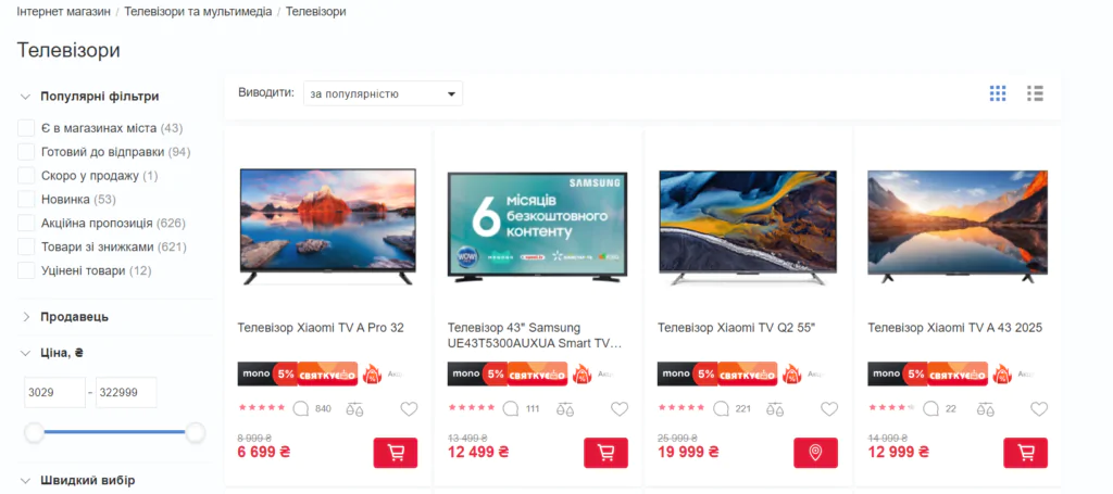
Filters greatly simplify the search for the desired products in the catalog. Buyers can quickly sort the assortment by price, popularity, availability or filter by desired characteristics: color, size, brand. If there are a lot of filtering options, give the ability to collapse and expand the list.
But it is not enough just to add filters. You need to carefully consider their priority and the order in which they are displayed. For example, it is better to arrange brands not alphabetically, but by popularity or margin. It makes sense to raise your own brands to the top in order to draw more attention to them.
Important! The names of filters should correspond to popular search queries. After all, they are part of the semantic core of the site and affect not only usability, but also SEO. The right headings will increase the visibility of the store in the rendition.
Optimize filters taking into account the needs and behavior of your customers. Analyze what criteria are most often searched for, which brands and features are most popular. Regularly update the structure and content of this block.
Fix the cart when scrolling the screen
Another seemingly small thing that greatly affects conversion rates. The shopping cart should always be in the visibility zone, so that the buyer can complete the checkout at any moment.
For this purpose, the button can be placed in a separate “sticky” block, which will be fixed at the bottom or top of the screen while scrolling the page. Thus, the buyer will not need to return to the header of the site and look for the shopping cart there.
Add social proofs to product cards
They are especially important if you sell products for children, food, medical products. Reviews (text or video), Q&As, etc. will work well here. You can also show in the card how many people have added the product to their favorites. This will attract attention and prove its demand.
But to motivate customers to leave feedback after a purchase, don’t stress them with email reminders, but encourage them with a discount or bonus. This way, you’ll get both relevant content and a satisfied customer.