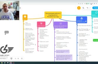
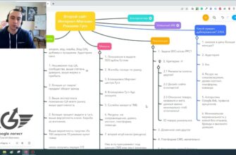
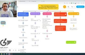
- Low sales in an online store due to lack of traffic
- Decreased sales in an online store due to product problems
- Few products in certain categories
- Short product descriptions or lack thereof
- Uninformative photos
- Falling sales in an online store due to pricing policy
- Prices are not listed on the website
- Prices for goods above or below the market
- The store does not bring sales because of usability problems
- It’s difficult to place an order
- Not enough information about the company
- Technical problems
- No contact details
- Unclear navigation
- Site takes a long time to load
- The “Recommended Products” block is not being used
- Unusual arrangement of elements
- Problems with reviews
Launching an online store is a major step for any entrepreneur. You have invested a lot of effort, time and money in creating a website, setting up advertising, finding suppliers and purchasing products. Your resource has been indexed in search engines, and you are looking forward to your first customers. But a week or two passes, and there are still no orders, or they are much less than previously expected. So why are there no sales in an online store?
The reasons can be many – from mistakes in choosing the assortment and pricing to usability problems due to too unusual design and ineffective advertising. Sometimes even an eCommerce platform that is excellent in every way can fail to live up to the expectations of its creators.
But what should you do if your online store doesn’t sell? Do not worry, we have collected all the main causes of sales problems in one place and prepared valuable tips on what to pay attention to in the first place, how to identify errors and flaws that hinder development.
How many calls and sales will I get by ordering contextual advertising from you?
I need to calculate the conversion of my website Describe
the task
in the application
Calculate potential ad revenue Google
contextual advertising calculator
Low sales in an online store due to lack of traffic
Lack or lack of traffic is one of the most common reasons for low sales in an online store. If you don’t have users coming to you, there will be no one to buy. According to research by Wolfgang Digital, the average online store converts only 1.6% of visitors into buyers. That is, to get 10 conversions per day, you will need at least 625 unique visitors.
To track resource traffic, you can use web analytics services, the most popular of which is Google Analytics. It allows you to find out how many people visit your website per day, where they come from, what they look at, how much time they spend reading your content, whether they take targeted actions, etc. Analyzing this information on a regular basis helps you identify potential traffic problems.
If analytics show that there are few visitors, you can take the following steps:
- Run contextual advertising. It is shown to those people who search for a particular product in a search engine. A properly set up campaign allows you to get up to 30% of total eCommerce site traffic and up to 20% of all sales. To set up such advertising, it is necessary to select relevant keywords, compose ads, design landing pages and regularly monitor bids and budget.
- Place your products on marketplaces and price aggregators. These are popular online marketplaces that collect offers from different sellers. They bring people interested in a particular product to the website. Placement is paid – usually it is a percentage of sales or a fee for clicks. For example, on Rozetka the commission is 3-15% depending on the specific category, and on Hotline.ua the fee is charged for each click on the link.
- Engage in SEO-optimization. According to statistics, 43% of traffic comes from organic search. The higher the site is in the keyword search results, the more Internet users it will be able to attract. For promotion it is important to collect semantics, optimize content for queries, ensure stable operation of the resource and usability, build a quality link mass.
- Engage in marketing in social networks. Here you can tell your audience about new products, promotions and discounts, answer questions and get feedback. SMM works for the company’s image and helps generate additional conversions.
- Collect and segment your email subscriber base. Since mass mailing the same offers to everyone doesn’t work anymore, to get the most out of it, segment your base by gender, age, interests, average check, and other parameters. And make personalized offers based on the segments.
Connecting one or more traffic channels will definitely lead to an increase in traffic. And if you work on increasing conversion rates in parallel, it is guaranteed to increase sales. But don’t forget to constantly analyze the results and optimize each channel to get the maximum return.
Decreased sales in an online store due to product problems
Assortment is the foundation of any online store. It is for it that potential customers come to you, so mistakes in working with the product can have a fatal effect on profits. So what are the most common assortment problems?
Few products in certain categories
A scarce assortment does not give the opportunity to choose exactly what customers like and creates the impression of a non-solid organization. The reason usually lies in the incorrect structure of the catalog. It is broken down into many narrow subcategories for the sake of better SEO optimization. As a result, you get sections with only 5-10 products. They can rank well in search and bring traffic, but as a result they get a decrease in sales in the online store.
Imagine: a person looking for running shoes, comes to you and sees only 3 models. And then compares with a neighboring resource, where in the same section 50 positions for every taste and color. What will he choose? The answer is obvious.
Therefore, you should constantly work on expanding and optimizing your assortment:
- Analyze competitors’ catalogs and compare with your own. Look at the structure of the sections, the number and variety of things in them. This will help to identify bottlenecks and gaps.
- Establish relationships with suppliers and add new items on a regular basis. Be aware of demand and market trends. Make sure there is enough choice in each category.
- Combine small subcategories with a small number of items into larger meaningful sections. And for ease of search add filters by key parameters – brand, size, color, etc.
- Expand your assortment with related products. For example, for laptops, suggest buying bags, mice, fabric covers, stands. It is important that it was relevant and useful products.
Of course, there are exceptions. For example, niche stores selling specific products – complex equipment, goods for unusual hobbies, etc. There may be an objectively small choice there. But if you work in highly competitive niches, a wide and deep assortment is a must. Otherwise, it will turn out that your online store does not sell, but advertises products for purchase on other resources.
Short product descriptions or lack thereof
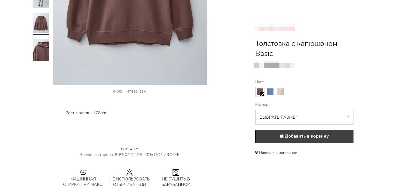
According to Marketshot, 98% of shoppers cite description as one of the deciding factors in their final purchase decision. So underestimating its importance is a big mistake.
Often on sites there are completely uninteresting and uninformative descriptions. For example, for “Leather jacket” the entire text consists of one phrase: “Leather jacket”. Agree, it is unlikely to inspire anyone to order it. After all, customers have a lot of questions – is it genuine leather, what is the cut and size, is there a print or inscription, how is it better than other similar models?
In order to answer all the possible questions of the audience, the description should be seriously worked on:
- Specify all the characteristics – material, size, weight, color, equipment, care conditions, etc. If it is clothing – add parameters and height of the model in the images. After reading, all possible customer questions should be answered accordingly.
- Disclose the benefits and advantages. Explain how the product will solve problems or improve the customer’s life. Pay attention to the TSS and set yourself apart from competitors.
- Write in simple and clear language. Avoid complex terms and abstruse phrases. One sentence – one thought. Highlight key information with subheadings and lists to make the text easy to scan.
- Use native photos and videos. They help you get a better look at the product and evaluate it in person. It is desirable to take several angles, detailed photos, show the product in use.
- Check the content for uniqueness. It is strictly forbidden to copy texts from competitors or manufacturers. Search engines penalize for this by lowering positions.
If it is not possible to write interesting and useful texts yourself, you can delegate this task to professionals. A good copywriter can be found on freelance exchanges or in specialized agencies. This will require additional costs, but quality content is worth it.
Uninformative photos
For online shopping, the visual component is critical. After all, a person cannot touch and examine a product in person, as in a conventional store. He has to rely solely on what he sees on the screen.
Many things in general are chosen based on their appearance. This applies to clothes, shoes, accessories, decorative items, household appliances, etc. Would you buy, for example, a dress if you saw only the text without a single photo? Hardly. No matter how colorful the description is, it is no substitute for visuals.
Photos are your main presentation tool. Therefore, it is definitely not possible to save money on them. It is desirable to have at least 3-4 pictures for each position:
- General plan, showing the item in its entirety and conveying its actual size and proportions;
- A medium shot from different angles so that the item can be evaluated from all sides;
- Macro shots of details and texture, especially if they represent a significant advantage;
- Interior or model photos to show the item in use and scale.
Don’t skimp on visual content. If possible, arrange for professional photography. Hire a photographer or arrange to work with suppliers and manufacturers. It is important that the pictures are high quality, informative and show the item at its best.
In some niches, it makes sense to think about video as well. For example, for paint, a video allows you to see how it sticks to the paper when applied or how it is mixed. For appliances and electronics, video reviews help you evaluate the functionality and understand exactly how the device works. Of course, creating a video is a more complicated and costly process, but it is worth it.
Falling sales in an online store due to pricing policy
Pricing is one of the key factors of success. An incorrectly chosen strategy can be one of the main reasons for a drop in sales in an online store. After all, if prices are overpriced relative to the market, people will go to competitors. And if underpriced – you will lose profit and will not be able to recoup costs.
Prices are not listed on the website
It may seem like a small thing. But in reality, many people simply won’t waste time trying to find out the real value of things. They would rather go where the price is immediately obvious. Moreover, the absence of a price is always alarming. People involuntarily have doubts: “Is the product available? Why is the seller afraid to show the prices? What if there’s a catch?”. In short, trust is plummeting. And with it, the likelihood of conversion.
So if you still have products labeled “Price on Demand”, fix it immediately. Indicate the price for all items without exception. It is desirable both for the basic configuration and for different modifications and sets.
Prices for goods above or below the market
In the first case, the buyer sees that competitors offer the same thing but cheaper and goes to them, because why overpay? According to Shopify statistics, 87% of online shoppers compare prices before placing the final order.
The second case can be so discouraging in general. People have a legitimate question: “Why is it so cheap? It must be a fake or a defect”. It turns out that you win the price, but lose the trust of the audience.
Of course, there are situations when the price differs from the average market price objectively. For example, you have your own production, cheaper suppliers or other competitive advantages. Then you should be sure to convey this to the end client. Create a separate section “Why is it profitable to buy from us?” and explain everything in detail there.
In other cases, we recommend following the following strategy:
- Monitor your competitors regularly. Especially for your key and best-selling positions. You can do this manually or with special tools like Google Ads.
- Keep your prices within the market corridor. Do not overestimate or underestimate them without good reasons. If you are trading in the low price segment, position yourself accordingly – we are cheap, but of high quality and with a guarantee!
- If the price is still different from competitors, justify why. Show your advantages and unique “features”. Free shipping, extended warranty, gifts and bonuses. So that the user understands what he is overpaying for or why it is so cheap.
In general, competent pricing is a whole science. But the basic principles are simple: the price must be adequate to the market, honest and transparent for the buyer. Then the price factor will not become a reason for a drop in sales. On the contrary, it can become your advantage over your competitors.
The store does not bring sales because of usability problems

If the site does not meet the expectations of customers, perhaps the matter is a low level of usability. This is the degree of usability of a web resource. The simpler and clearer the navigation, the more convenient the location of the main elements of the page and shorter feedback forms, the higher the probability that the visitor will place an order.
If your online store sins with the following shortcomings, it’s no wonder that the rates are low. People simply can’t order goods because of complicated navigation, lack of information or slow loading speeds.
Here are some clear examples of why an online store doesn’t bring in sales:
It’s difficult to place an order
This is one of the main reasons for low conversion rates. If a visitor has to fill in a lot of fields, register or perform unnecessary actions, he is highly likely to refuse to do it and go to competitors with a simpler and clearer design.
An ideal checkout usually involves 2-3 clicks – selecting the desired product, adding it to the cart and directly paying. If the buyer is new – you don’t need to force him to register an account for checkout. You can offer to create an account in one click in the process, for example, by checking the corresponding checkbox.
Also, don’t distract visitors with unnecessary actions like subscribing to a newsletter or taking surveys. All efforts should be focused on bringing the purchase to the final “Pay” button.
Another benefit of one-page checkout is increased conversion on mobile devices. Typing on a phone is much more difficult than on a computer, and the fewer actions required for the end result, the more likely they are to be completed.
How many calls and sales will I get by ordering contextual advertising from you?
I need to calculate the conversion of my website Describe
the task
in the application
Calculate potential ad revenue Google
contextual advertising calculator
To optimize the checkout, try ordering something yourself, filling out all the basic fields. Record the entire process on video and count the number of clicks. If you get more than 3-5 clicks, simplify the form by removing unnecessary fields, break everything into separate steps, disable mandatory registration.
Not enough information about the company
Buyers want to find the right product and understand the conditions of its purchase. According to statistics, about 50% of users leave the site if they do not find detailed information about delivery and payment terms. Here you should provide maximum details – delivery terms and costs for specific regions, possible ways of making transactions, return conditions, warranty, etc.
Be sure to create separate pages that answer these questions and place links to them in the header or main menu. Additionally, add brief information in the product cards and cart. If there is no “Shipping and Payment” section, make it first. Otherwise, conversion will inevitably suffer, regardless of the size of the catalog and price level.
Remember that all data must be up-to-date. If the buyer sees in the cart a price higher than that stated in the category or advertisement, or does not find a suitable method of payment – he will in most cases refuse the order.
Also indicate the legal name of the company, contacts, details for payment. This increases trust and allows you to be contacted in case of questions or difficulties with an order. If the customer sees that there is a real organization behind the online store, he will be more willing to make a purchase.
Technical problems
URLs that don’t work, errors in code, incorrect page display in different browsers – all this prevents customers from placing an order and causes them to defect to competitors.
In order to avoid errors in the work of the site, in addition to regular manual testing, it makes sense to set up a “sales funnel” in Google Analytics or another similar service. It will clearly show at what stage of the application process the largest number of users is lost. For example, if a significant part of visitors close the page when choosing a delivery method, you need to change something at this stage.
Having detected errors, try to eliminate them promptly. If they are related to the technical part (code, broken links, “crooked” layout, hosting), it is better to contact a professional developer. If the issue is inaccurate information or an inconvenient interface, make the necessary corrections yourself.
After the situation is corrected, continue to monitor the work of the web resource on a regular basis. Make “test purchases” at least 1-2 times a month, and each time after any major changes – design updates, customization of a new payment module, integration with the accounting system, etc.
No contact details
In Ukraine, many people prefer to place an order by phone. A call allows you to clarify availability, ask questions about characteristics and delivery conditions, talk to the manager and make sure he is adequate.
If you don’t find a phone number or e-mail on the site, the visitor is likely to go to a competitor. The first thing to check is whether the contact details are in place. Include both mobile and landline numbers. Include an e-mail address, links to social media accounts and messengers. Nowadays it is more convenient for many people to write to Viber, Telegram or WhatsApp than to call.
Ideally, you should make a separate page with contacts and duplicate the basic information (phone, e-mail, social networks) in the header of the site, as well as in the basement. The visitor should find a way to contact you as soon as possible and without too much effort. Do not forget to specify and actual working hours, while taking into account weekends and holidays.
We also recommend connecting an online consultant or chat room. In this way, sales managers will be able to answer questions promptly, help with the selection of goods, and unobtrusively push you to make a request. The main thing is to ensure an instant response to requests, otherwise the chat will be of little use.
Unclear navigation
When the assortment has thousands of items, it is extremely important to think about how the visitor will find the desired products. If it is inconvenient to do this, he will leave for competitors before he even gets to the page of the product he is looking for.
The basis of good navigation is a logical structure of categories. Goods should be organized into sections so that people can intuitively understand where to go for this or that product. And there should not be a lot of categories – it is so easy to get confused. It is optimal to have 5-7 top-level sections, which are divided into subcategories.
It is also important to implement a smart site search, which will understand the user’s request, even if it contains errors or inaccuracies. It will not be superfluous to set up search hints with automatic addition of the search phrase to speed up the process. And after the results are displayed, you can also show the user relevant filters (by price, brand, characteristics, etc.), with which he can quickly narrow down the selection.
In addition, add to the site blocks “Sales Hits”, “Popular Products”, “New Products Discussed”, etc. They can serve as “engines” of sales, because often people browsing the goods, do not know what exactly want to buy, and are guided by the choice of other buyers. Make on the main page of the zone “You may be interested in” with products that are most often bought or special offers.
Site takes a long time to load

According to Google, 53% of mobile users leave if a page takes longer than 3 seconds to open. In the era of high speeds, people are not willing to wait, and a slow site is guaranteed to lose customers.
You can estimate the loading speed by using the free PageSpeed Insights service from Google. It will not only show the site response time, but also give recommendations on how to speed it up. Most often speed is affected by:
- Unoptimized images (large size, unsuitable format);
- Incorrect connection of scripts and styles (all requests should be asynchronous);
- Lack of caching on the server;
- Excessive plugins and widgets that slow down loading;
- Low-quality hosting.
If your site loads longer than 3 seconds, connect programmers and together look for bottlenecks. Optimize code and content, set up caching, choose fast hosting. Every second of delay can cost you lost orders, so working on speed should be a priority.
The “Recommended Products” block is not being used
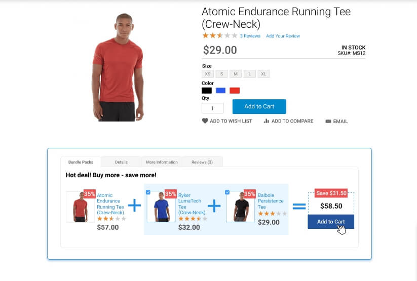
This is a powerful tool for increasing sales, which, unfortunately, is not used by all online retailers. And for nothing, because it can keep the visitor on the site, even if the product he has chosen is not suitable.
The essence of the “Recommended Products” section is to offer alternatives and additions to the product being viewed. For example, if a person came to the page of a certain smartphone model, you can show a block “This product is often bought with this product” with covers, protective glass, external batteries. Or a section “Related Products” with other smartphones of the same price category and functionality.
This way, the user will have more options to choose from and is more likely to click on one of the recommendations. Even if the initial product did not suit him, he can find an alternative right here on your site, instead of going to your competitors. This technique is especially useful for brand stores – the visitor looks at a particular model, but sees other products of his favorite brand, and there is a good chance that he will be tempted by something else.
Recommendation blocks also help to increase the average check. A person came for a smartphone and left with a case, headphones, and an additional warranty. Or chose not the cheapest model, but a slightly more sophisticated one, from those that are “often bought”.
Unusual arrangement of elements
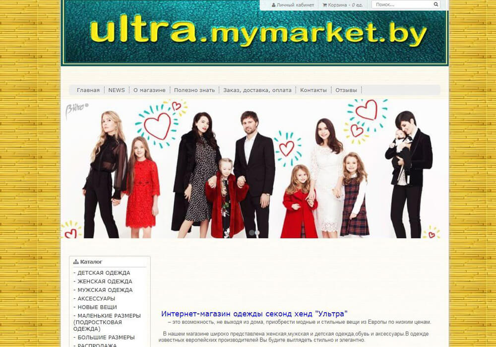
In an effort to improve the user experience, the most important thing is not to go overboard. It happens that in the pursuit of originality, designers and marketers reinvent the wheel: they place familiar elements in unfamiliar places, mask buttons, overload the interface with animation and non-standard solutions.
As a result, usability suffers. The user can’t find the main menu, doesn’t understand how to add a product to the cart, can’t see the buttons because they blend in with the background. He has to think and click too much to make the desired action. And in an online store, every extra click is a potentially lost sale.
Therefore, when developing and optimizing your site, follow the rule: the simpler the better. Do not force visitors to solve puzzles and look for basic navigation elements in unexpected places. The layout of menus, filters, cart and favorites icons, “buy” and “add to cart” buttons should be intuitive and familiar to most users.
This does not mean that you need to use the same templates. Originality is welcome, but not at the expense of convenience. Find a balance: let your design be fresh and memorable, but understandable at a glance.
Test the site on “test subjects” from your target audience. If a person can not navigate where to look for the desired section or how to place an order – the design is not intuitive enough. Collect feedback, identify problem areas and simplify navigation. There are no little things in this business – a second hiccup and the online store has few sales.
Problems with reviews

Today, people are used to relying on other customers’ opinions when choosing products and services. According to Google Analytics, more than 90% of shoppers read other users’ opinions before making a final purchase, and 84% trust them as much as they trust recommendations from family or friends. Before buying anything, the average person will spend time reading reviews, especially when it comes to expensive products. Current statistics also tell us about this:
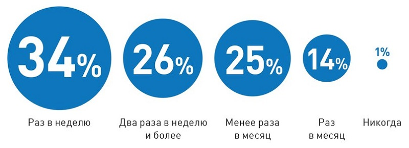
The presence and quality of reviews on your website, in social networks, on third-party platforms can directly influence the decision to buy. If a potential client sees negative feedback about a company, the likelihood of conversion decreases dramatically. But positive feedback and a high rating, on the contrary, will build trust and stimulate sales.
However, satisfied customers rarely leave reviews on their own initiative. But dissatisfied customers write willingly, often exaggerating the scale of the “tragedy”. In this way, the overall picture can look worse than it really is and scare off potential customers.
Your online reputation needs to be monitored and worked on to improve. Here are some proven strategies:
- Regularly monitor brand mentions on all platforms. Set up alerts on review sites, social networks, Prom.ua and any similar sources where customers can write.
- Respond to reviews, especially negative ones. Constructive criticism – thank the person and tell how you will correct the situation. Offensive or blatantly false feedback – correctly explain your position and offer a solution in a personal correspondence.
- Never delete negative reviews or close comments – you risk provoking more negativity. The only exceptions are outright spam, flooding, and foul language.
- Analyze customer complaints and use them as insights to improve your product and service. Complaints about long delivery times – optimize logistics. Complaints about the quality of goods – work with suppliers or change the assortment. Dissatisfied with call center staff – provide additional training.
- Incentivize customers to leave feedback, especially positive feedback. Offer a small bonus or discount on their next purchase for a detailed review with photos. Give a prize to everyone who writes a review within a month.
- Motivate customers to create UGC content – post photos and videos, share impressions, tag your brand. Encourage the best posts, make reposts. This way, you’ll get valuable feedback and increase brand reach at the same time.

