Abandoned carts in an online store can appear for many reasons – from a banal lack of money on the buyer’s card to his desire to compare offers from different sellers. Someone simply studies the assortment, adds favorite items to the favorites for the future. When marketers decided to survey users about the reasons for this behavior, 58% of them answered “I was just looking”.
The modern buyer has become more demanding and picky. The abundance of quality online stores allows him to easily switch between different sites in search of the best. He can add goods to virtual carts as much as he likes without a firm intention to buy something right now.
At the same time, considerable funds are invested in the creation and promotion of websites. Budgets for SEO, contextual advertising, SMM can reach hundreds of thousands of hryvnias – all for the sake of attracting targeted visitors. It would seem that it’s just a matter of convincing them to click the coveted “Checkout” button. But no, the person leaves halfway through, taking the company’s potential profit with him.
So how can this problem be solved? What prevents people from completing a purchase? Is there any way to influence their decision? Today let’s try to deal with it.
What is an abandoned cart in an online store?
An abandoned cart is a fairly common and extremely unpleasant situation that every online seller faces. A person adds an item to the cart and then simply leaves the site without completing the order. In essence, this is an unfinished transaction that does not bring profit.
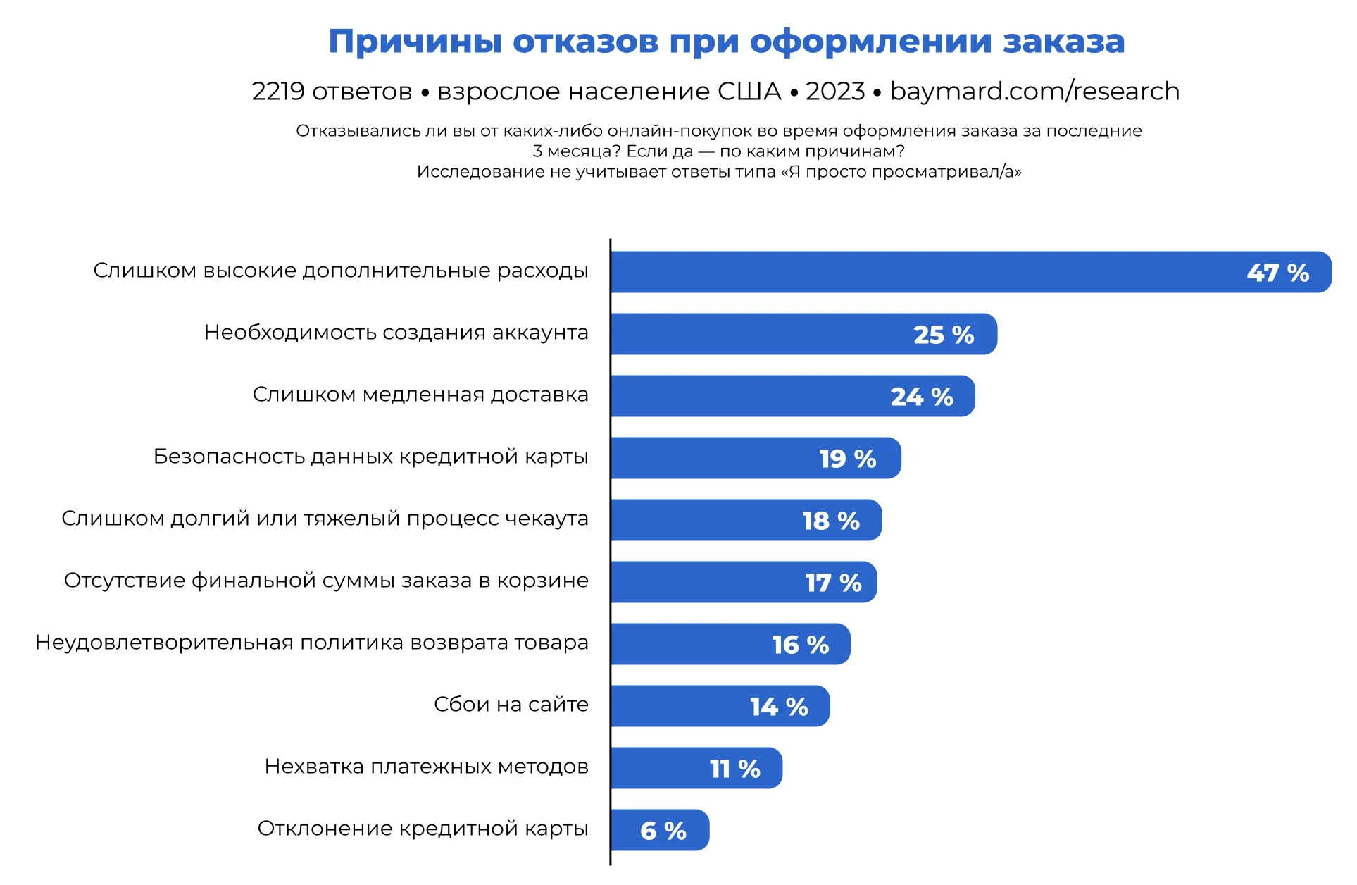
Statistics show that on average about 70% of carts suffer such a sad fate. At the same time, there is a stable dependence on the type of device – for smartphones the figure reaches about 74%, while for personal computers and tablets it is about 63%.
In addition, during the first acquaintance with a brand, 92% of users do not plan to buy immediately, even if they have added items to the cart. It usually takes about five contacts with a brand to complete the transaction. However, in any case, it is better to strive to reduce the number of abandoned carts, because the lower the figure, the higher the potential profit.
How to know the percentage of abandoned carts on the site?
To track this dynamics, a special indicator is used – the abandoned cart ratio. It can be calculated using a special formula. It can also be found out in analytical systems, if they are connected to the online store.
Формула расчёта

To get the coefficient, take the number of orders placed, divide by the number of carts formed and subtract the resulting value from one. And then multiply the result by 100 to get the expression in percent.
Let’s say you had 250 orders placed in a month and 800 carts created. Substitute the figures into the formula:
1 – (250 / 800) = 0,68
0,68 х 100 = 68%
The final figure, 68%, is what will determine the ratio.
Google Analytics
This is an easier way. The service allows you to track the number of incomplete orders in the “Conversions” ⇒ “E-commerce” section ⇒ “Customer Behavior”.
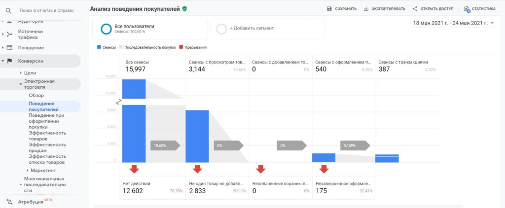
Here you will see not only the total number of abandoned carts, but also more detailed statistics. How many people got “stuck” on the payment page, and how many people left the cart itself without even starting to fill in the data.
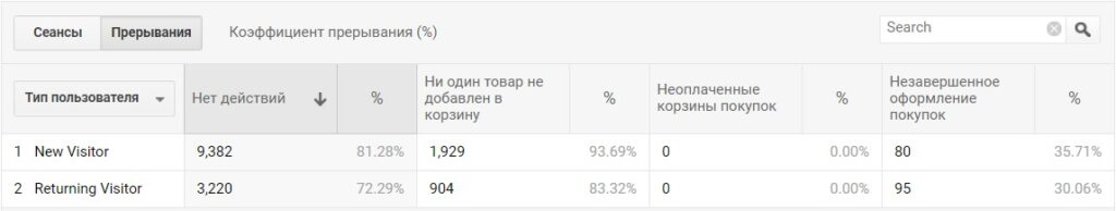
So on the example above we can see that out of 175 carts about 36% were abandoned by new visitors while 30% were abandoned by those users who had already visited the site before.
The main reasons for abandoned carts
There can be a variety of reasons for abandoned carts. Let’s consider the most popular ones.
The client simply compared prices with competitors
In the pursuit of the best price, many buyers turn into a kind of “discount hunters”. They methodically go through dozens of online resources in search of the best offer. And your online store in this case is just one of many contenders.
It is practically useless to fight this approach. These people know exactly the average market prices for the products they are interested in and are unlikely to buy without a substantial discount. In addition, the process of finding the best price for them is a kind of entertainment, a way to spend leisure time.
How to fix it:
There is still a certain chance to attract such an audience. Your task is to convince the visitor that he will not find a better offer. To do this, you can play on the time factor. Send a message to a person with a discount offer and add a time limit to it. For example, the price will be 10% lower if you buy the product within 3 hours.
It is also possible to make the offer more favorable and comprehensive. Suppose a person was choosing a phone and left to compare prices. Remind him about the saved model, and at the same time recommend useful accessories – case, charger, protective glass. Show him that it will cost less as a set than individually.
A guaranteed gift is a win-win. Or a cumulative discount. The main thing that the benefit was real, not imaginary. After all, “bargain hunters” are very good at distinguishing really good offers from marketing tricks.
Too high a price
The point here is not always that competitors have cheaper prices. Sometimes stores themselves provoke their customers to refuse, hiding from them the real cost with all the additional costs.
A common trick of marketers is to show an understated price in the shop window, without taking into account additional mandatory payments. Let’s say a client sees that a product will cost him 1000 hryvnias and starts placing an order. And then it turns out that the cost of transportation, insurance, and taxes will have to be added to the price. The result is an extra 300-400 hryvnias on top – and that’s at best.
This approach can work in offline stores, where a clever salesman manages to divert a person’s attention and quickly finalize the deal. But these tricks will not work online. Moreover, they are almost guaranteed to spoil the impression and undermine the credibility of the company.
After all, what does a person feel when faced with an unfair price tag? That’s right, deception and a desire to go to a competitor. The internet is full of stores and it’s easy to find an alternative. Why stay where they’re trying to trick you?
Solution:
- List all mandatory charges in the product card right away. Include all taxes, fees, transportation and packaging charges in the displayed price. Yes, the final price tag may not be as attractive. But the potential buyer will not feel cheated.
- Offer multiple delivery methods. Everyone has different goals. Some need it faster, some need it cheaper, others need it delivered at a certain time and place. Offer several options that vary in time and price. For example, express delivery within a couple of hours at an extra cost and regular delivery at a cheaper price. The wider the choice, the more likely you are to please every visitor.
- Organize self-collection. Many people prefer to pick up their order themselves so they don’t have to pay for transportation or wait for a courier. In addition, self-pickup is a great way to communicate personally with your target audience to better understand their needs and optimize your service.
- If your budget allows, offer free delivery. Of course, not for the entire range and under certain conditions. For example, if the total amount of the order is not less than 2500 hryvnias. Such a bonus not only motivates you to make the originally planned purchase, it encourages you to buy even more.
- Want to stand out from your competitors? Make free delivery your UTP (unique selling proposition). Include the cost of logistics in the price of your products and write about it in your advertising. This way you will show your care for your customers and save them from unnecessary calculations.
You need to register to place an order
Let’s face it. Not everyone who comes to the site plans to become your regular customer. Someone wants to make a one-off transaction, someone is just exploring the assortment and so on. And these people are unlikely to be thrilled about having to spend time filling out a registration form.
What to do:
- Allow purchases without registration. Allow unregistered visitors to place orders by entering only the most necessary fields – name, phone number, address. And to motivate them to leave other data, tell them about the benefits of registration. For example, offer accumulative bonuses, discounts or free shipping for creating a personal profile.
- Introduce the “Buy in one click” function. This is the easiest and fastest way to make an application, which requires a minimum of actions from a person. Usually it is enough just to enter the phone number and click on the confirmation key. Everything else – details, address, payment method – can be clarified by the manager over the phone. This approach significantly reduces the rejection rate, but, unfortunately, it also increases the load on the call center. What is more important – it is up to you to decide.
- Add authorization through social networks. Today, most people have Facebook or Google accounts. Allow them to register or log in through these services. This way you will both simplify their life and get access to valuable information for audience research – name, gender, age, customer interests.
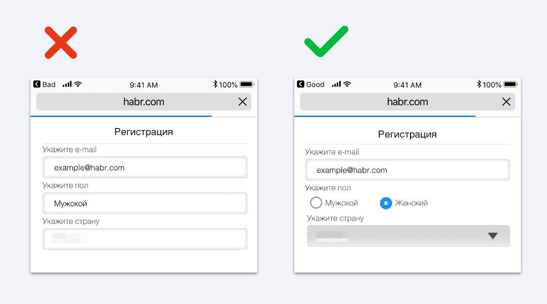
- Optimize the registration form. If you can’t do without it, minimize the number of mandatory fields. Leave only those without which the order cannot be placed and delivered. Offer to fill in all the rest in your personal cabinet after the purchase has been made. In addition, simplify the process itself. For example, use drop-down lists instead of filling in fields manually. Include autocomplete and tooltips where possible.
Customers do not trust the store
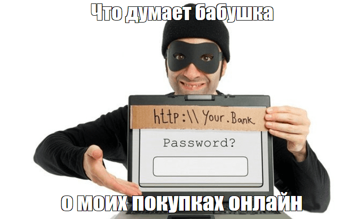
Unfortunately, virtual space has become a fertile ground for all sorts of fraudsters and unscrupulous sellers. It is not surprising that many people are cautious about new and little-known resources, even if at first glance they seem attractive.
One of the main reasons for mistrust is dubious ways of accepting payments. If instead of the usual and reliable payment systems you need to transfer money to an obscure account or if you are redirected to another site when you click the “Buy” button, this is a serious reason to be wary.
Another reason for refusal may be the need to share confidential data (card number, online banking password). In addition, the requirement to follow a suspicious link to “activate an order” will also arouse suspicion. Such manipulations almost certainly indicate fraud.
Too low prices and generous discounts can also be alarming. No matter how tempting the offer looks, a sensible person will be suspicious rather than pleased. After all, it could mean that the seller either saves on quality or is not going to sell anything at all.
The same applies to the lack of real reviews and contacts for communication. If the seller is not ready to communicate openly and hides his physical location, it clearly does not inspire confidence. Like stock photos instead of “live” pictures, a minimalistic description of the company in the “About Us” section, and the absence of pages with guarantees and return conditions. All these are signs that this online store is either brand new or created solely to collect money from gullible people.
How to fix it:
- Provide as much contact information as possible. Provide all possible means of communication – phone numbers, email, messengers, social networks, physical address with a link to Google maps. People need to see that behind the virtual showcase are real people, ready to answer their questions and solve problems.
- Give clear guarantees and return instructions. The advice section should detail the return and exchange procedure. Show that you value your customers and will meet their needs if something does not fit or quality is not satisfactory.
- Collect feedback. It’s not enough to simply install a module with testimonials on your site. You also need to actively encourage your audience to leave them – for example, through mailings or surveys. Better yet, incentivize buyers with small bonuses for posting a response.
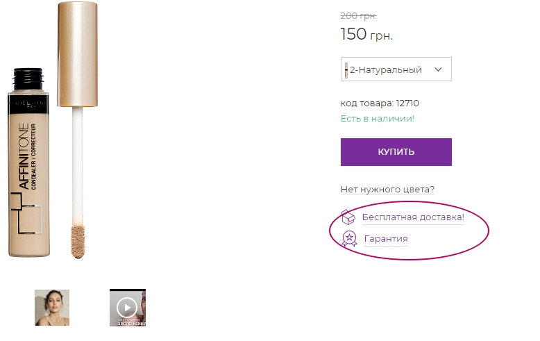
- Provide an extended warranty. A statement like “return and exchange within 14 days” is no longer impressive. To stand out from your competitors, you will have to give more substantial guarantees – for example, a refund within 30-60 days or free service for a year. This is a serious argument in favor of your reliability.
- Provide documentation. Place scans of certificates, testimonials, awards in the appropriate section on the website. Provide links to state registers where you can check your company. All this increases business transparency and builds trust.
- Ensure the security of personal data and payments. Install an SSL certificate so that data is transmitted via the secure https protocol. Place the icons of the payment systems you work with – Visa, MasterCard, etc. in prominent places. Be prepared to explain exactly how you store and process personal data to allay possible concerns.
- Invest in brand recognition and reputation. If authoritative media will write about you, the brand will be recommended by experts and satisfied customers, the need for additional “trust marks” will be much less. So don’t spare money on PR and cooperation with opinion leaders. This is work for the future, which will definitely pay off in audience loyalty.
Usability problems
Every potential customer wants to find the desired item as quickly and easily as possible, put it in the shopping cart and, in fact, order. Any obstacles along the way can be a reason to refuse to complete the transaction.
So, if a visitor to an online platform has to deal with the intricacies of categories and filters for a long time, it causes irritation and a desire to quickly close the page. Especially if the structure of the catalog is inconsistent and illogical, the names of sections are not obvious, and the chain of transition to the desired page is too long.
Poor design, poorly readable fonts, clutter of elements, abundance of pop-ups – all this makes perception difficult and repulsive. Instead of concentrating on product selection, the audience is forced to strain their eyesight, look for buttons and fight the desire to go to competitors as soon as possible.
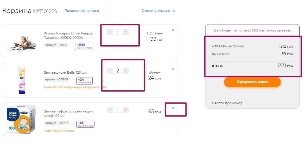
It is also important to pay attention to the usability of the shopping cart itself. It would seem that a person has already chosen everything and is ready to pay. But even at this stage it can be lost because of an inconvenient interface.
For example, if in the shopping cart there is no opportunity to change the number of selected items, to remove unnecessary ones, to see real photos. Or the total amount is not displayed. All these seemingly small things can make a person doubt his choice and refuse to buy.
How to solve the problem:
- Test the checkout process from start to finish. Put yourself in the buyer’s shoes and follow the path from selection to purchase confirmation. Pay attention to all potential exit points – complicated registration forms, low-visibility buttons. Involve friends, family, and colleagues in testing – their fresh look from the outside will help you identify non-obvious problems. Based on the test results, make a detailed list of necessary improvements and submit it to designers and developers.
- Optimize the design and navigation. Make sure that all elements – buttons, forms, filters – are visible and intuitive. Use contrasting colors, large readable fonts, sufficient indentation between blocks. Develop a logical and consistent catalog structure, avoid too long paths to the product. Menus should be simple and clear, and searches should be quick and relevant.
- Adapt your site for different devices. According to Statista, in 2024, more than 72% of all online orders will be made from smartphones. This means that having a mobile-friendly version is no longer a fad, but a necessity. Test how the resource displays and works on different models of phones and tablets. If necessary, develop a separate mobile application.
The site is slow to load
According to research, most people are willing to wait no more than 3 seconds for a page to finally load on a website. If it takes longer to load, there is a high probability that people will simply close the tab. This can be compared to a long queue at a supermarket checkout – no one wants to waste their time.
For example, AliExpress shared a telling statistic – speeding up page loading by 36% led to a 10.5% increase in the number of orders, and conversion increased by as much as 27%. These numbers clearly demonstrate how important speed optimization is to the success of an online business.
In addition, performance problems are often accompanied by errors and incorrect page performance. Hiccups and glitches can finally discourage a potential customer. He may think that it is easier and faster to buy everything he needs elsewhere than to waste his nerves on endless waiting.
How to solve:
Task your developers to speed up your website. Experienced specialists will conduct an audit, find bottlenecks and offer optimization solutions. Caching settings, image compression, code minification and other technical improvements can help with this problem.
Unfortunately, however, not everything depends on you. Slow Internet at the client, poor coverage of mobile networks, outdated “hardware” of the computer – all this can also create performance problems.
The site layout is not adapted for all screen resolutions
Imagine a situation – a person has a free moment on the way home and decided to place an order from his phone. But instead of a convenient interface, he is met with an order form that sprawls across the entire screen, small unreadable text and buttons that cannot be reached with a finger. Most likely, he will simply close the tab and look for competitors with an interface adapted for mobile devices.
Today, the lack of a mobile version is no longer just a flaw, but a critical error. If your site is incorrectly displayed on smartphones, you are guaranteed to lose a significant part of your audience.
In addition, an adaptive interface is important not only for user experience, but also for search engine optimization. Google, as well as other search engines, takes mobile adaptation into account when ranking in organic search. If your online store is not optimized for smartphones, it will lose search positions and therefore free search traffic.
How to fix it:
- Get busy adapting for mobile gadgets. The site should automatically adjust to different screen resolutions, ensuring that it is easy to use on smartphones and tablets. Menus, buttons and other controls should be large enough to be easily accessible even on small screens.
- Optimize the size and quality of media files. Bulky images and videos can significantly slow down page load times, especially on slow Internet connections. To avoid this, compress images without loss of quality and use adaptive image formats (e.g. WebP).
- Reduce the amount of text and input fields. Long descriptions and multi-page forms can look out of place on small smartphone screens.
Many unnecessary fields in the shopping cart
If a person, when trying to place an order, is greeted by a long and cumbersome form with an innumerable number of fields, he can quickly leave for competitors. Especially when, in addition to first name, last name and address, he is required to specify his age, occupation, where he learned about the store, etc.
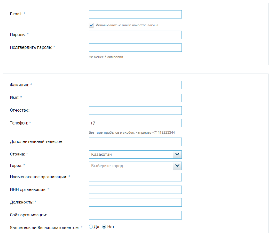
According to research, each additional field in the form can reduce conversion by 5-10%. This means that even 2-3 extra questions can result in losing 10-30% of customers. And if there are too many fields, this figure can be even higher.
What to do:
- Collect only the information that is really necessary. In most cases, it is enough to specify first and last name, phone number, address, e-mail (optional, but will allow you to maintain communication with the client in the future). It is better to leave all other fields optional or remove them altogether. You can always find out more information later, for example, by phone.
- Break the form into several separate pages. This way it will be psychologically easier for the buyer to fill it out, and the progress bar will show how many steps are left to complete.
Not all forms of payment are available
If a customer does not find a suitable payment option, there is a high probability that he or she will simply abandon the shopping cart. For example, a person has already selected the desired goods and filled in the necessary information. At the last moment, it turns out that the goods cannot be paid for upon receipt. The buyer does not have a credit card.
Maybe the customer prefers Apple or Google Pay, although the online store accepts bank transfers only. He is unlikely to start a separate card in the right bank or register in a payment system for the sake of a single purchase.
What you can do:
- Provide as many payment options as possible. Be sure to add the option to pay for your order upon receipt. This is especially important for new customers who do not trust your store yet and are not ready to share their card number with you. If possible, connect all popular payment acceptance services in Ukraine – Monobank, Privatbank, LiqPay, Fondy, PayPall, WayForPay. The more payment gateways are involved – the higher the chances that the buyer will not choose competitors.
- Find out what your target audience thinks. Conduct a survey among your clients – ask them which payment methods they use more often. It may turn out that a significant part of the audience prefers a particular service that you have not yet activated. Based on the collected data, you will be able to prioritize and add the most popular options first.
How else can you solve the problem of abandoned carts in an online store?
It is unlikely that you will be able to solve the problem completely. Abandoned carts will only disappear when you have no customers left at all. So what do you do with abandoned carts in that case? Just leave everything to fend for itself? Absolutely not, mankind has already come up with tools to help minimize its impact on business.
Email newsletters
Be sure to collect contacts of your target audience, even if they are not ready to buy immediately. In the future, you can send them a welcome email with a lucrative offer – a discount on a product added to favorites, or a promo code. This will remind the user of forgotten purchases and motivate them to come back.
Don’t forget to limit the time of validity of promotions. Specify the deadline right in the subject line – this will create a sense of urgency and prevent the offer from going unnoticed.
And, of course, think about the content of the email:
- Use an attractive, intriguing subject line. For example, the option, “You forgot something from us…” will work much better than the boring “Viewed products”.
- Insert a photo and description of the abandoned products – visuals increase clickability.
- Address the recipient using their name, explain why they need to hurry with their order (perhaps they may run out of stock).
- Put a clear button in the email with a call to action – “Complete the order” instead of a vague “Return to the store”.
- Send such emails in a timely manner. Optimally – within an hour after the user has left the cart. After that, the conversion rate will start to decrease.
Remarketing
This is a powerful tool to bring back users who have started but not completed checkout. With personalized ads, you can remind them of forgotten items and nudge them in the right direction.
At the same time, you can use information about user behavior to increase the relevance of the offer. If a user stops at the last step, show them an ad reminding them that they are almost out of stock. For those who abandon the cart in the early stages, it makes sense to offer a discount coupon or free shipping.
Important! You can launch remarketing campaigns not only in Google Ads. Use Facebook, Instagram, Twitter and other social networks for this purpose. The main thing is to keep a balance and not to appear intrusive.
Try to experiment with formats, texts and ad design. What appeals to one audience may not work for another. Analyze statistics and constantly optimize your campaigns.
Online chat
According to Forrester research, 50% of shoppers prefer to learn product details and delivery terms via online chat or messengers. Chat allows you to answer visitors’ questions as quickly as possible. They will be able to instantly find out the necessary information and continue placing an order.
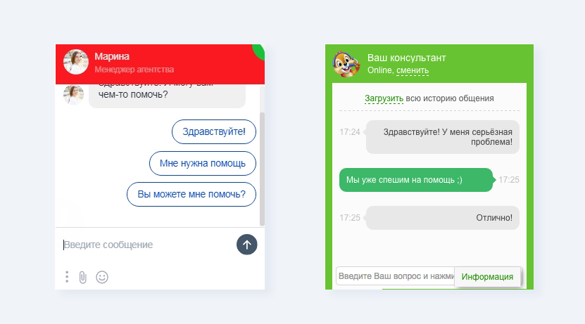
For the chat to work well, you need to:
- Add a feedback form in a prominent place.
- Provide ready-made options for answering the operator’s greeting. This will save time and make communication convenient for users.
- Provide a quick response. According to Hubspot, it’s important to 90% of customers that a response to their query is instantaneous.
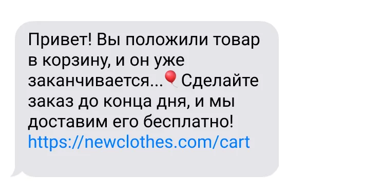
SMS messaging
This communication channel is especially effective when combined with email marketing. If you see that a subscriber has not opened an email about an abandoned cart, try sending an SMS. You can send an offer to buy forgotten items at a discount at checkout within 48 hours.
Pop-Ups
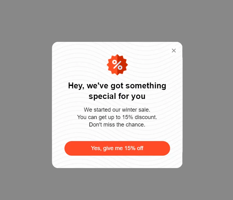
They allow you to “catch” the user at the moment when he is about to leave the site, and offer him additional incentives. For example, you can show a pop-up with a promo code for a discount. This will help remove objections and encourage you to buy. You can also play on the illusion of scarcity by informing that the product is running out or the promotion is valid for a limited time.
According to the Optimonk platform, well-customized Pop-Ups bring up to 20% of users back to shopping. To create effective pop-ups you need to:
- Offer a real benefit. A discount, free shipping or a gift for ordering – something that can really interest the buyer.
- Use a bright but unobtrusive design. Pop-Up should attract attention, but not annoying and not cover the whole screen.
- Show the pop-up at the right moment. Best of all, when the visitor is about to close the tab or click the “back” button. Special tools like OptinMonster can recognize these actions.
- Conduct tests. Try different variations of text, design and offers. Analyze which Pop-Ups get the best results and scale them.
- Don’t forget about mobile users. Be sure to adapt pop-ups to the small screens of smartphones.
But don’t forget about legal restrictions. Some countries have clear requirements for Pop-Ups, including the ability to easily close them. Be sure to keep these rules in mind to avoid penalties and negativity.
Promo Codes
Many customers come to the store just because they have a discount code. It’s important to make sure they can easily apply it. Make it clear where to insert the promo code – provide a separate field on the cart page or in the checkout process.
Make sure that the discount is instantly displayed in the order summary. The customer should see that the promo code has worked and the amount to be paid has decreased. This will incentivize the customer to proceed to payment faster while the special price is in effect.