Hello, everyone! My name is Yana Lyashenko, and I am a Google logist—I help businesses attract the audience that is ready to buy. Today, I want to talk about what product photos to add to your website so that your product page works to its full potential and brings in more sales.
I will discuss six or seven types of images that must be included on a product card. Without them, increasing conversion rates is nearly impossible. Why are photos so important? Because online shoppers can’t touch the product, hold it in their hands, or assess its size or quality. Images do all of this for them. And if they are chosen correctly, people are more likely to click the “Buy” button.
Ready to figure out exactly what pictures you need? Then let’s go!
And yes, a quick reminder: I have a Telegram channel and Instagram account where I share the latest case studies, observations, and all sorts of useful tips. Information appears there faster than on YouTube, so subscribe—it will be interesting.
Classic e-commerce image
Let’s start with the basics—classic e-commerce product photography. This is the first image that buyers see, and it should immediately convey what exactly you are selling.
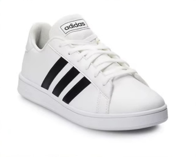
There is an important nuance here. If your product is intended to be worn on the body—jewelry, watches, glasses, clothing, shoes—show it in use. It is better to photograph earrings in the ear, a bracelet on the wrist, a jacket on a model. Do not just post a flat photo of a sweater on a table. Show how it fits on a person, what its cut is like, how it looks in real life. This immediately answers half of the buyer’s questions and increases trust.
What background should you choose for your product photos? Google recommends using neutral light colors—white, light gray, beige. This is especially critical for expensive items: a stylish image on a calm background is automatically associated with quality and premium value. But a bright red or toxic orange background is a recipe for failure. Yes, some sellers try to stand out on Google Shopping this way, but the effect is usually the opposite.
Important note: product photos should not contain watermarks or extraneous text, as Google may reject such cards. If you really want to add text, integrate it as part of the product itself. For example, text on the back of a chair or a print on a T-shirt. This way, you will convey the information and avoid moderation issues.
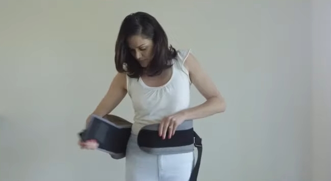
Product in use
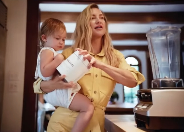
The second mandatory type of photo is the product in use. Show how a person interacts with your product: drinking from a cup, putting on a jacket, sitting in a chair, holding a gadget in their hands.
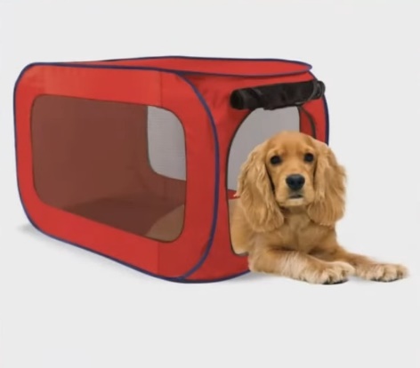
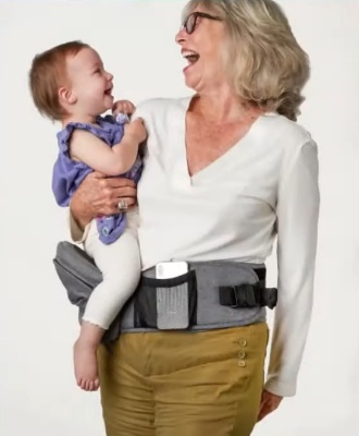
Such images help buyers imagine the product in their own lives. An abstract image on a white background is fine, but photos in a real-life context are much more effective.
Tip: Add happy faces to your photos. Especially if you are selling to the American market, where smiling is as natural as breathing. Note the difference between typical Instagram content from the CIS (a pensive gaze, philosophical reflection on existence) and American photos (a beaming smile in any situation). For Western audiences, joyful emotions in photos are the norm and the expectation.
A few practical examples of how this works:
- Garlands. Not just a string of lights on the table, but a garland on the curtain in the evening, when the lights shine beautifully in the dark. You can add a daytime shot for comparison.
- Seat covers. Not just a cover, but a cover in a real car, preferably with someone behind the wheel.
- Painting. Not a canvas by the wall, but a painting on the wall in the interior — so that the buyer can immediately see how it will look in their home.
The principle is simple: display the product where it will live after purchase.
Photos for different body types, skin tones, and sizes
The following type of images is rarely used, especially in Ukrainian e-commerce. It is more common in Western markets, but even in Europe, not all sellers have adopted this technique. And that’s a shame.
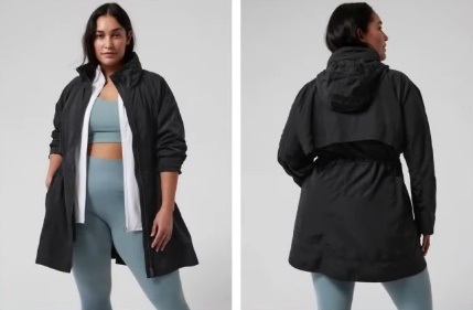
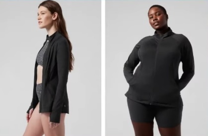
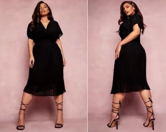
If your product can be customized to different parameters—skin tone, body type, height, foot size—be sure to show this in the photo.
Plus-size clothing is a great example. It’s an incredibly profitable niche if you approach it wisely. But what usually happens? The website shows a photo of a dress on a slim size 42 model, and the drop-down menu offers sizes up to 5XL. How is a buyer supposed to know how this dress will fit her figure?
Copy the approach used by American stores: place photos of the same item on models of different sizes — XS, L, and 3XL — side by side. The buyer can immediately see how the fit changes, where the folds will be, and how the length looks.
The same applies to shoes. Everyone is interested in how sneakers look on a petite size 36 foot and on a size 45 foot. This is especially important for sneakers, chunky sneakers, and dress shoes. Don’t just show the shoe on the foot — show what size it is so that the buyer can compare it to their own measurements.
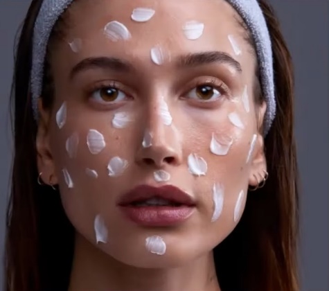
Cosmetics are another category where this is critically important. Promoting a cream for women over 50? Show a woman of that age in the photo, not a 25-year-old girl. Selling foundation or BB cream that adapts to skin tone? Photograph the result on models with different skin tones, from light to dark.
Why are those Chinese videos on TikTok, where girls apply foundation with patting motions, so popular? Because they show the real effect on real skin. Your task is to apply this principle to photos for the website.
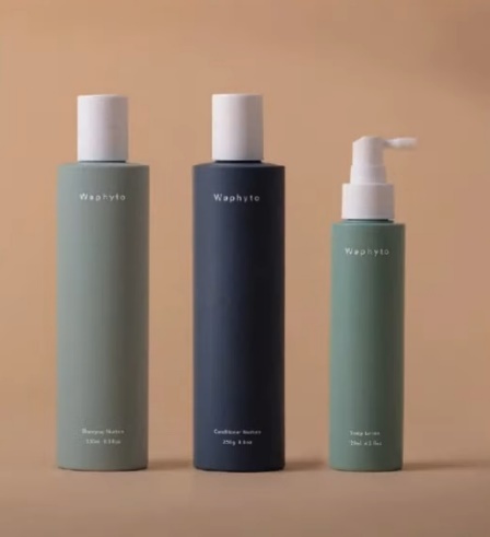
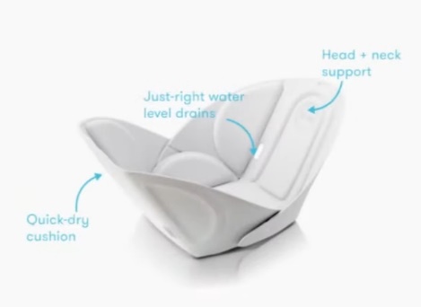
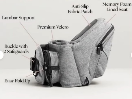
Photo with important product features
This could be the composition, ingredients, materials, safety certificates, environmental friendliness — everything that is important for making a purchase decision.
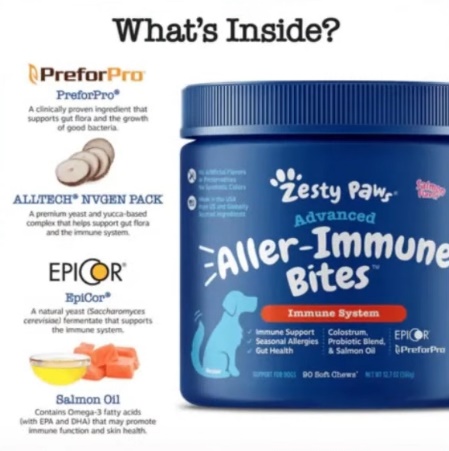
How can this be implemented? Place icons, symbols, or text explanations with key information next to the product. This will create a unique infographic for the product card that instantly conveys the value of the product.
Cosmetics for the American market are a prime example. There, it is critically important for buyers to know that the product is vegan, the packaging is recyclable, the ingredients are biodegradable, and the contents are not just glycerin and petroleum jelly. All of this needs to be highlighted in a separate image.
By the way, if you have an Instagram account, you probably already have some suitable content. A photo of a jar of vitamin C serum surrounded by oranges? Great, add it to the website. Yes, it may seem far-fetched, but the buyer’s brain works on associations — they see oranges and automatically associate the product with naturalness and health benefits. This directly affects conversion.
Examples for different niches:
- Clothing. Specify the fabric composition—polyester, viscose, cotton. If you use premium materials, this is your selling point, so showcase it.
- Kitchen appliances. Coffee grinder or meat grinder? Add information about the metal used to make the blades and body.
- Frying pans. Teflon coating, ceramic, titanium — there are many varieties. Put the type of coating and its advantages on a separate picture.
Can’t take a nice photo? No worries. Infographics with icons and text work just as well, and sometimes even better—the information can be read in seconds.
Before/after photos
This is a universal technique that works for almost any product if you approach it with imagination.
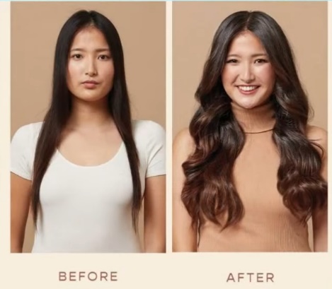
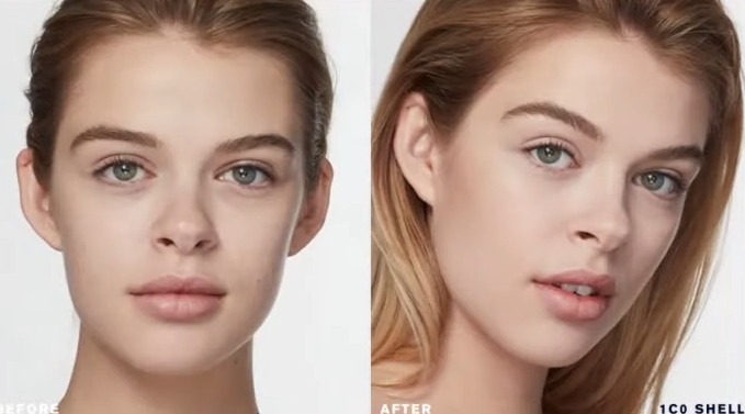
Do you think that before/after is only about cosmetics or weight loss? Not at all. Here are a few examples of how to apply this format in different niches:
- Cosmetics. A classic example of this genre is showing the condition of the skin before using the cream and after a course of application.
- New Year’s garlands and Christmas trees. Divide the picture in half: on the left is a normal room, on the right is the same room with a garland that glows in the dark. The “wow” effect is guaranteed.
- Vitamins and dietary supplements. Show a person before—tired, pale, lacking energy. And after—lively, with a healthy complexion, full of strength.
- Cleaning products. A burnt pot before cleaning and sparkling clean after—one of the most convincing arguments for buying.
- Cleaning products. A dirty carpet, stained tiles, a neglected oven — and the result after using your product.
The principle works everywhere. Selling organizers? Show the chaos in the drawer before and the perfect order after. Selling hair dye? Before—dull color, after—rich shade. Selling furniture covers? Before—worn-out sofa, after—the same sofa, but like new.
Before/after photos for your website are not just pictures; they are visual proof that your product works. And proof sells better than words ever could.
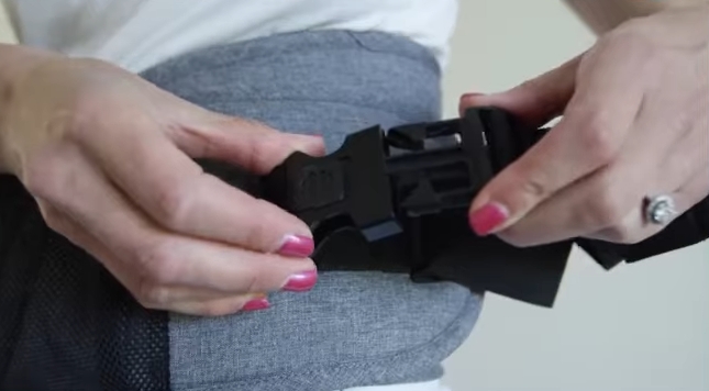
Detailed, high-quality product photos
Close-ups showing textures, seams, small details, and accessories. This is especially important for products that are bought with the eyes—where visuals play a decisive role in the decision-making process.

Selling a dress? Don’t limit yourself to a general shot of the model. Show the quality of the seams separately, what the fabric looks like up close, how the fasteners or decorative elements are made. Selling notebooks? Take pictures of the binding, the texture of the paper, and what the notebook looks like when open. The same goes for garlands — show close-ups of what the bulbs, wires, and fasteners look like.
Here’s the problem with most online stores: they all use the same stock photos from the supplier. Visit ten stores and you’ll see identical pictures of a vacuum cleaner or phone case everywhere. Want to stand out? Take photos from different angles and show what your competitors are too lazy to photograph.
Headphones are a particular pain. Try Googling AirPods or any other popular models. Most sellers have such blurry photos that it’s impossible to tell whether they’re originals or copies, what condition the product is in, or what the details look like. But people want to examine a purchase before handing over their money.
And the main sin is low-quality photos on the website. You try to enlarge the image to see the details, but all you see is pixels. This is especially critical for refurbished equipment, repaired goods, and used products. Those who sell refurbished iPhones or MacBooks understand what we are talking about—it is important for the buyer to see the actual condition, every scratch and scuff.
Take high-quality photos of your products for your online store—clear, detailed, with zoom capability. It’s not just about aesthetics; it directly affects trust and conversion rates.
Photo with instructions for use and terms of purchase
Not all products have obvious uses, and clear instructions remove the barrier to purchase. But that’s not all. Individual images can be used to display information about purchase conditions, which really works to boost conversion rates.
What can be taken from the pictures:
- Warranty. Especially if yours is longer than your competitors’. Do you sell abroad? A 14-day warranty looks weak compared to 30, 45, or 90 days. If you can offer more, be sure to show it visually.
- Free shipping. The truck icon with “$0” or “0 UAH” is instantly recognizable. Is shipping free for orders over a certain amount? Include that in the image as well.
- Payment terms. Cash on delivery, prepayment, installment plans — if this is important to your audience, visualize it.
- Returns policy. If you have a generous returns policy and this is your competitive advantage, make sure to highlight it.
Why is this important? People find it easier to take in information visually. They might scroll past the text in a product description, but they’ll notice a bright picture with a free shipping icon right away.
A small caveat: if you place such images in the product feed for Google Shopping, some elements may not pass moderation. Here you need to test — try different options and see what passes and what doesn’t. But on the website itself, in the product card gallery, such photos with delivery and warranty conditions will definitely not be superfluous.
Photos from real buyers
Sold a car hood? Ask the buyer to send you a photo of them standing happily next to their repaired car. Selling cosmetics? Ask your customers to share selfies with your product. User-generated content like this is more powerful than any studio shoot.

Why is this effective? People are tired of perfectly photoshopped, polished images. Everyone wants to see what a product looks like in real life, not in a studio with professional lighting. Think about how often you visit the reviews section with photos and videos on Rozetka. It’s interesting to see what a vacuum cleaner actually looks like in a normal apartment, how a TV looks on the wall, or how big a thermos is in your hand.
Here’s what’s interesting: this technique works even in the most unexpected niches. Do you sell hydraulic cylinders or other spare parts? Take a photo of a satisfied customer with their purchase. It sounds ridiculous — who takes photos with a hydraulic cylinder? But that’s exactly why it will work. No one else does it, but you will — and you’ll stand out.
A sofa, bed, wardrobe, Christmas tree, baby stroller, bicycle—for any product, you can ask the buyer to send a photo with the product. Many customers will be happy to share, especially if you offer a small bonus or discount on their next purchase.
Real photos from customers are social proof that removes doubts and encourages purchases. Use this to your advantage.
Video and GIF animation on the product card
And finally, a recommendation that many people don’t like. Some of my clients literally groan when I say this. But I’ll say it anyway: add videos to your website.

The video or GIF animation should be included in the product image carousel. What exactly should you film? Anything: how to use the product, what it looks like in real life, a short promotional video. The format is not that important — what matters is the fact that there is a video.
Examples for different niches:
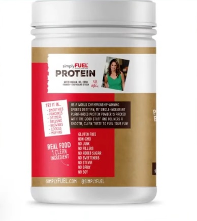
- Dietary supplements and health products. Take a photo of the jar with your phone and show the ingredients on the label. If the jar is translucent, show how the capsules roll around inside. Selling protein? Take a photo of the jar and show what the powder looks like in a measuring spoon.
- Auto parts. Come to the warehouse and pick them up right there. “Guys, look—we have everything here, I’ll find what you need, at any price.” That’s enough. A simple video from the warehouse—and conversion rates go up.
- Clothing and accessories. A short video where the model turns around shows the item in motion — much more informative than static photos.
Now, an important point about video content quality and filming style. There is no universal rule here—it all depends on the product and price segment.
Are you selling something expensive or emotional purchase items? Then yes, you need to bother with a stylish picture. The video should look solid and fit organically into the overall aesthetics of the brand. Expensive goods require expensive presentation.
But what if the niche is simpler? In auto parts, no one will believe a polished manager in a suit. But an ordinary Vasily Petrovich, who films his warehouse on his phone, inspires trust. A quick video will be the best solution here.
The same goes for clothing. Do you sell mid-range and mid-plus segment items? Invest in high-quality photography. Do you sell budget lingerie for 100 hryvnia? The more stylish you make the photo, the more it will repel buyers, who will decide that it is expensive. Simple underwear on an ordinary person without unnecessary glamour is the ideal option.
Take these recommendations and implement them on your website. Approach the issue creatively, test different formats. Photos and videos to increase conversion rates are not rocket science; they are systematic work on product cards. And it pays off.
See you in the next issues!