Hello! My name is Yana. The topic of today’s video is hidden interface solutions used by most online stores in order to increase not only their average check, but also their profits.
Guys from Princeton University analyzed more than 11,000 online stores for the use of hidden interface solutions that force the user to take the desired and necessary action on the site. This is the moment where ethics and the desire to make a profit, more profit, strongly border on each other. Whether or not to use these hidden revealed patterns is up to you. From an ethical point of view, it is not recommended to use them, they hang us a little as a user. Although in supermarkets the use of the smell of baking, active, dynamic, relaxing music is also a hidden pattern that it affects customers.
By the way, the link to the official scientific study of the guys is placed in the infobox – you can familiarize yourself with it, read it. Perhaps subtract more – a list of selected online stores, of course, not all in a row, not the poorest, unfortunate ones. Using the rating of online stores according to Alex’s voice assistant, the researchers found several main categories of influences – more than 15. Such patterns are called consumer fraud – pay attention! Through the analysis, we found 22 third-party organizations that can study hidden interface solutions, their implementation for trading sites.
Let’s start with the analysis of the main categories.
Adding more items to the cart
The first category concerns the addition of some additional items to our online shopping cart, which under normal conditions users do not agree to. A few examples of such an addition.
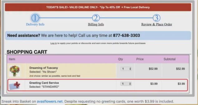
Here, some congratulatory picture has been added. The price is 3.99, not even $4, you can refuse, you can not refuse. With a greater degree of probability, the user will not refuse. The price of the check is not big and he will leave a postcard.
 < /p>
< /p>
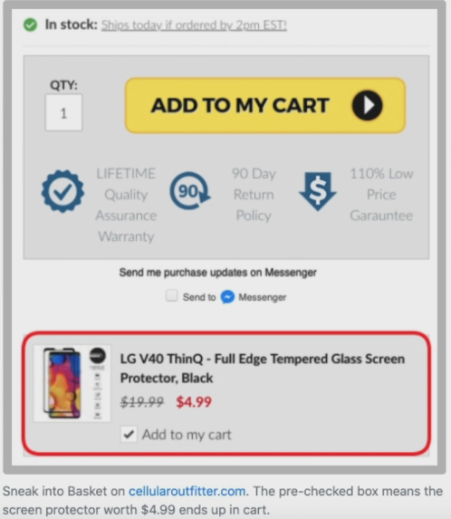
The second screenshot shows a kind of adding something to the cart. Buy a smartphone here. A film is already initially offered for it, the “Add to Cart” checkbox is already on. The issue price is $4.99, not even $5. That’s right, not a very big cost, the film will still be needed. Here it is necessary to pay attention not to the check, but to the offer of the current position. If they offered some kind of hair bands, they might not buy it, depending, of course, on the context. The film goes to the phone for anyone. There is also a check mark here. After reading the works of the guys involved in the analysis of behavior in social networks, you can find out that page scrolling takes up some certain share of the user’s energy consumption. Adding a checkmark will affect some users, they will just be too lazy to uncheck it – $ 5 is not a very big price.
Hidden costs at checkout
The next point concerns hidden costs that are not initially visible, they pop up when placing an order and paying.
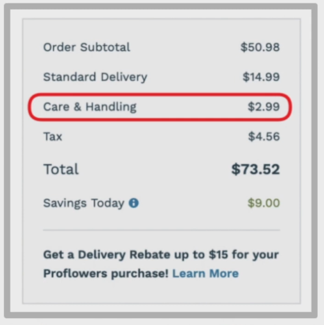
First Screenshot of Care & Handling – Care & Handling Fee – 2.99, revealed in the last step. As they say – a penny, a penny and you get a billionaire. 2.99 is not a very large check, but it is a scam, you do not initially include this mandatory payment in the price. In this case, this is a mandatory payment, and it cannot be excluded. The user will agree if the value of the purchased product is much higher for him.
Hidden subscriptions to goods or services
Third point – hidden subscriptions.
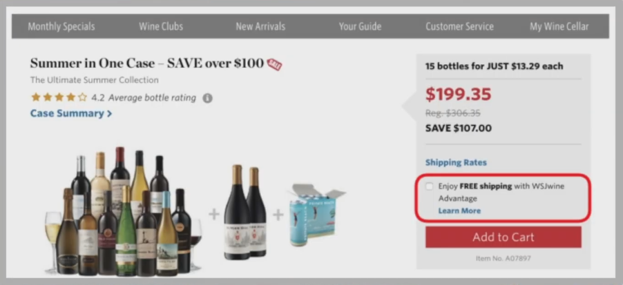
In the first screenshot, you will now see the purchase of alcohol products, pay attention to the highlighted element – “Enjoy free shipping with WS/wine Adwantage” and the inscription Learn more. With a high probability you will check the box – free shipping, free shipping – highlighted in bold.
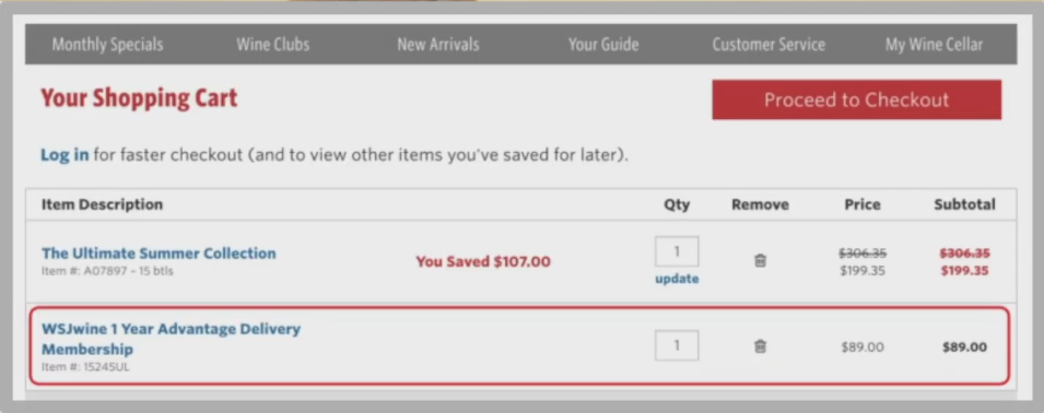
When you go to the cart – this WS/wine Adwantage is 89 bucks. This is a hidden subscription, when you select it at the stage of adding to the cart, you do not see the amount of the cost, it opens at the stage before-checkout.
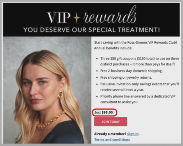
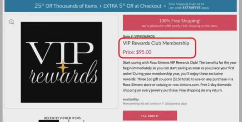
An example of hidden adding subscriptions to the cart – the screenshot shows that joining the VIP rewards club does not reveal a recurring subscription of $ 95 until conditions are clicked.
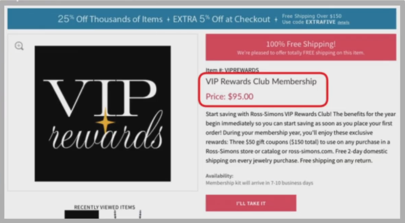
These are hidden patterns used by many. And in principle, paradoxically, you can refuse, not use the proposed service. But people still pay this subscription, erroneously inattentively, someone thinks “Come on. What will happen from this? This is an example of an increase in the average check.
Adding urgency blocks
The second category concerns blocks of urgency, this is when there are some kind of timers, setting a deadline for the promotion, etc. Let’s look at the hidden patterns that influence user behavior.
Adding countdown timers
The first one is the countdown timers. In the CIS market, they are popular, to be honest, the developers mold them everywhere. Our user is already accustomed if there is a countdown timer, then in most cases it is not believable. Only if he came across a real promotion with a real timer – in the future, this online store with such timers will be treated more carefully. Well, what about the majority? Plugged it in and it looks like it should work. Really not. Timers need to be correctly substituted for the correct context.
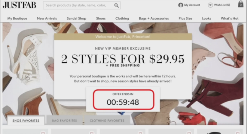
This countdown timer was found on 361 websites out of 393. The screenshot shows an example of such a timer, in this case the offer was valid after the timer ended. The guys got confused, analyzed.
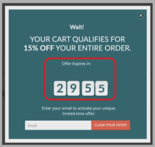
The second screenshot is also a countdown timer, only in a pop-up window, the stated offer is valid even after the half-hour timer expires.
Promotions without expiration dates
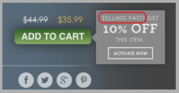
The second sub-item of the urgency category is to indicate to users that the promotion is about to expire, without specifying deadlines. This is the easiest way to indicate that the promotion will end soon. Found on 84 sites out of 88 cases. Big percentage.
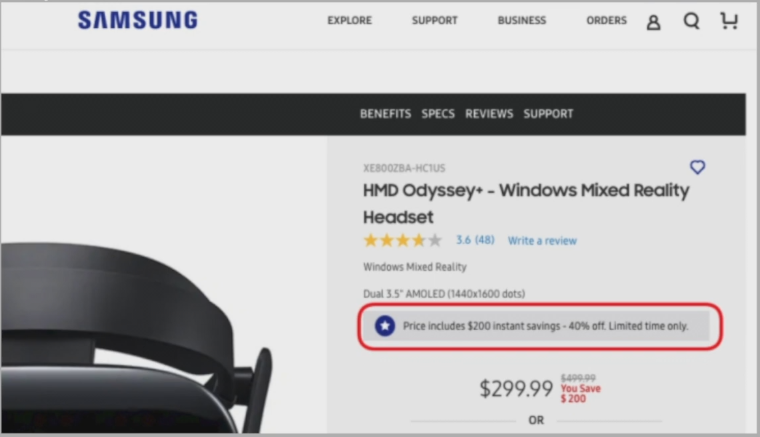
The screenshot shows an example of Samsung, the website states that the deal is valid for a limited time, but the time is not specified.
Using visual, emotional and other elements
The next category is the use of some kind of visual effects, language, emotions to direct the user in the required direction.
Using the language of emotions
The first point concerns the confirmation of some form of transfer of order forms and other things. It was found on 164 sites out of 169. A large percentage.
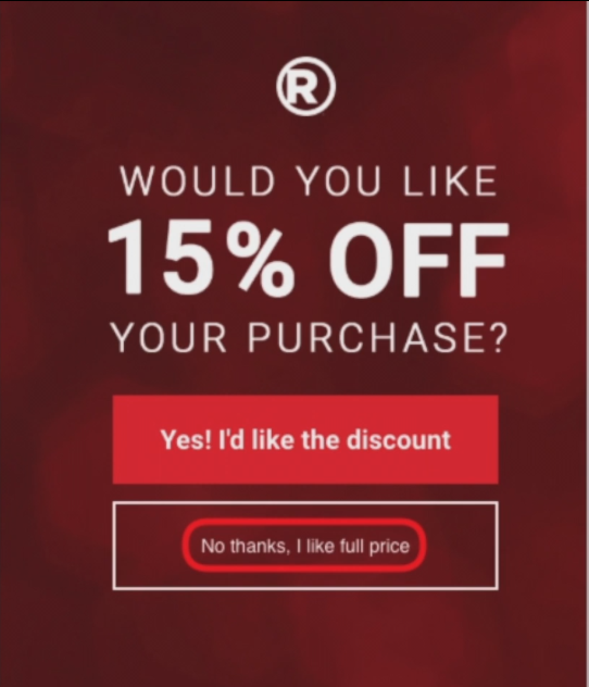 < /p>
< /p>
In the screenshot, you see a pop-up window where it says “Would you like to get a 15 percent discount on your order.” Usually, when such an annoying form pops up, we usually look for a cross to close it, in principle, its essence is blurred. the guys cunningly entered radioshack.com. The option to reject the pop-up is set, of course, but there are two buttons – “Yes, I want to get a discount” or the second “No, thanks. I want full price. This hidden pattern is used, more likely to select a discount. Well, of course, we are smart people. True, we want a discount – this is a reasonable decision. It’s just that here you are more likely to leave your contacts for this discount than just reject and turn off this form.
Visual interference
The second sub-item of the category is visual interventions. Found on 24 sites out of 25.
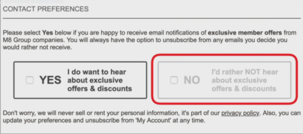
In the screenshot you can see the form and the “No” block, it looks greyish, it’s different from “Yes”. The trick is that in connection with the use of a lot of some electronic resources, websites and other things, such a color is associated with blocking the possibility of using this option. Actually “No” is available with a tick to highlight with a tick. It’s just that in this case the user is sort of directed to the “Yes” block.
Using obfuscated language
The third sub-item of this large category is tricky questions. In nine cases out of nine, they were found.
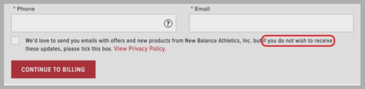
Leaving a checkmark is associated with confirming something. In this case, the checkbox is set to refuse to receive messages, mailing lists, etc.
Pressure on the user
The fourth subparagraph is a kind of pressure on the user. When the user is a little forced to choose an expensive product option on a particular site. Found on 62 sites and 67.
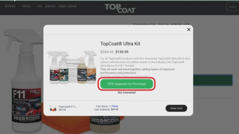
In the screenshot you can see the button “Yes, update my order”. When adding an item to the cart, a pop-up window appears asking you to update your purchase.
Unreliable social proof
The next big category of hidden patterns is social proof. This is when some notifications are added on the site, small flags that something has been viewed, the number of purchased goods added in a certain geographic region.
Notification about activity of other users
The first sub-item is an activity message, informing the user about the ongoing activity on the site. Found on 264 sites out of 313.
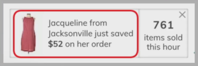
First screenshot of thredup.com showing Jacqueline’s name and Jacksonville location of buyers of the product. The message always signals that the sold products are simply kept by the buyers, even if they are sold for a long period of time. On some sites, you paid attention – you have already bought so many commodity items, some have been added, saved, so many were interested in commodity items.
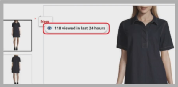
The next moment is a screenshot of impressions for the last 24 hours. Why does this moment work so well. Take, for example, street food with two stalls – pizza or shawarma. In one there is a long queue, in the second there are only two people or no one, while the quality is absolutely the same or in the second case it can be tastier. But we succumb to the herd instinct – if there is a queue, then we must take it, only there is cool, cool. Our stores use more top sales. which are sometimes artificially placed on some blocks, commodity items or top of choice, top purchases, hit of the month, etc. Sometimes stores put them on the basis of real statistics, sometimes they put them down artificially. This can simply tell a person what to choose, whether it is in demand, relevant, and plus creates an element of herding. You can use this not very hidden unethical moment.
Reviews of unknown origin
The second subparagraph is reviews of unknown origin. This is when reviews are written, it is simply not clear where they are taken from, from what source and the mechanism for obtaining them is unknown. Our CIS sites are very guilty of this.
The user may ask where we got the real reviews from and most stores might not even say where they got them from. Or you sculpt these repetitive reviews, but they are the same. Users understand that this is not a real review.
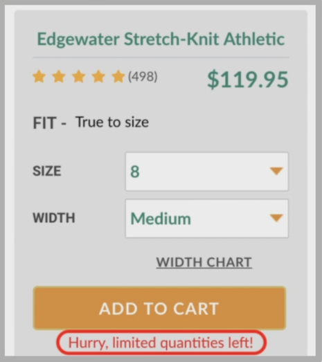
Notice about limited products on the site
The next category is big – signals that the goods will soon run out or in a very limited amount. This example was found on 581 sites out of 632 occurrences.
Low stock message
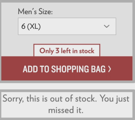
In the screenshot, there are three items left in stock. The choice of product is quite limited and it seems that the product is already almost sold out and you need to hurry, because there may not be any left.
The screenshot is similar, but it doesn’t show the remaining amount, it just says that the amount is limited. This is a fairly popular technique, please note that not all of our online stores use it.
High demand message
The second point is texts or messages that the product or product is in very high demand. Found on 43 sites out of 47.
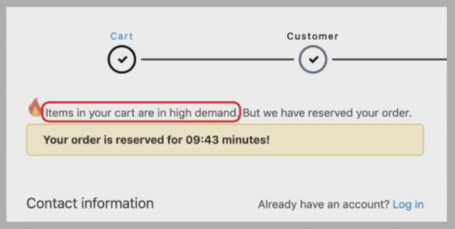
For example, fashionnova.com shows a message to all product items that they are in high demand, and a little light is added.
On pacificcoast.com, the message is displayed to all products on the site.
Simplify or complicate situations for users to push them to make a certain decision
The next category is the creation of conditions when it is easier to agree to what the business owners need, to complicate the moments that are not particularly beneficial to us. On a specific example – the hard-to-cancel certain actions. Found in 10 cases out of 10.
Creating situations where it is hard to undo some actions on the site
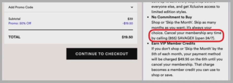
At savegex.com, the only way to cancel the $49.95 auto-renewal is to call support. On the other hand, registration can be completed online. Calling support is one thing if a girl says “OK. I’ll cancel everything now ”and another, when you have to wait – press one if you want Russian, press two if you want Ukrainian, if you agree that the conversation will be recorded. Understanding how long it takes – a person can just get tired of doing it and leave the option – which is necessary for us, the owners of the site.
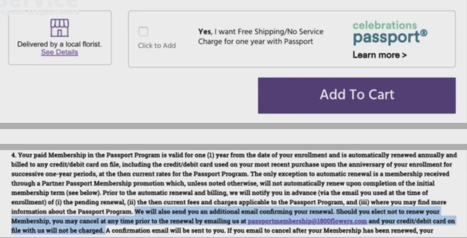
1800flowers.com screenshot – The only way to cancel the $20 membership auto-renewal is to send an email to customer support, as opposed to signing up, which is easily done online. Agree, you can wait a long time for a response to a letter in customer support, sometimes it will be fast. With this hidden pattern, we direct users to do what we need.
Forcing the user to take an action to solve their problem
The next category is when the seller adds some enforcement action to the site. Something needs to be done in order to continue using the product or browsing. For example, forced registration. Previously, on Modnaya Kast, in order to enter to view a certain set of products, you had to log in through your Facebook or Google profile, or register. This was found in six cases out of six.
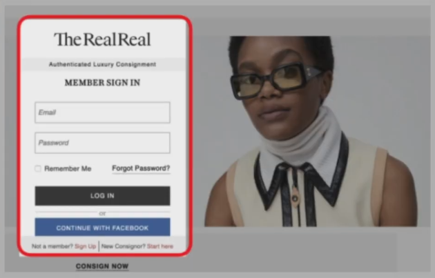
On therealreal.com, browsing products requires registration.
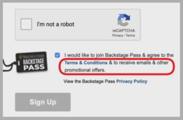
The site musiciansfriend.com requires agreement to the terms of use, as well as consent to receive emails, promotions. If you want to benefit, agree to the mass mailing right away.
Conclusion
This is the main set of categories, hidden patterns, used by most online stores, trading sites and platforms. You can use or not use. To be honest, as a marketer, I would test them, especially since part of this toolkit is already in use. Of course, this is a deliberate deception of the consumer when we are directed to do what we need. This is marketing – the task is to connect the user with our product for profit.
Кстати, если ты не согласен со мной или ты знаешь какие-то дополнительные скрытые паттерны, которые используют интернет-магазины – пишите в комментариях. Я думаю мне и остальным специалистам, рекламодателям, бизнесу будет полезно это почитать. Если это видео было тебе полезным ставь по традиции like кнопочку подписаться, колокольчик чтобы не пропускать новые полезные выпуски. Но и в принципе до встречи в новом выпуске.