- Goals of the video about the analysis of cases of 3 online stores
- Melons and goals of the first store
- Setting up smartshopping in the first store
- Auction statistics analysis
- Comparison of transaction rates
- What is recommended to add to product cards?
- Weekly results for the second store
- Suggestions for improving the second store
- Summary. What needs to be improved on the websites of the three stores
Hello. My name is Yana Lyashenko – Google Logistician. I am engaged in the delivery of the target audience of the business with the necessary parameters.
Goals of the video about the analysis of cases of 3 online stores
Today’s video will be quite unusual. In most cases, you get some pretty significant benefit from the video. I decided to shoot a kind of analysis of 3 cases in the same niche – in the subject of furniture. Cases directly from our team.
To show the nuances that are in the same niche, in different online stores. What influenced the result. What are the points that you could learn for yourself, apply, respectively, improve the current result. The furniture niche is not particularly light. Promising, but not particularly easy to run Google ads, for sure. Three different online stores will be submitted for comparison. Shops in one niche furniture. Beds, sofas, chairs, dining tables, cabinets, all sorts of panels to understand. One store only had beds. I will definitely point this out.
How many calls and sales will I get by ordering contextual advertising from you?
I need to calculate the conversion of my website Describe
the task
in the application
Calculate potential ad revenue Google
contextual advertising calculator
There will be a monthly comparison. month of work. One month of work in each of the three projects. The projects are fundamentally different. First, budgets. Secondly, the goals that the team had to achieve. I’ll tell you what the goals are in each case. And the result. I will indicate what you can specifically apply to improve the current result.
Melons and goals of the first store
Statistics for one month. By the period you can orient yourself, one of the stores. The largest online store in terms of advertising budget. An approximate result for a not particularly successful month. There were months when the profitability was even better – 800 and approached almost 1000.
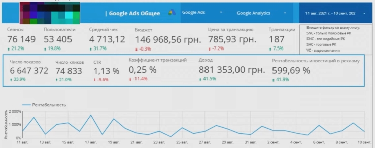
This online store wanted to focus only on transactions and their profitability. Well, of course, we wanted to reach a certain turnover. Target value in profitability wanted a thousand. As I said, the results were better.
I will not delve into the nuances that have arisen in the case. If you want, I’ll make a separate video. Maybe I’ll make a separate video. Digital values, approximately, of such a plan came out.
What does he have? The focus is on transactions. The ratio of certain target KPIs. What did it influence? It influenced the selection by the average check of the product range, which are the easiest to convert under a thousand profitability. A certain allocation of budgeting only for certain product categories that are more likely to convert for a given store.
What’s the problem? In the main share, although a check of 4,713 is visible, there were commodity items cheaper and more expensive. Among the product range of furniture were commodity items as a very high price tag, above 25-30 thousand hryvnia, and conditionally, 4, 5, 7, 12 thousand hryvnia product range.
The nuance lies in the process of accompanying the client, for a rather long period of time, it was necessary to force automation to change the way of targeting the target audience. Why?
Expensive check, it conditionally differs in different niches. In fishing conditionally 2000 hryvnia. In furniture conditionally 40 thousand hryvnia. And it differs depending on the niche. Some specific number in each niche is different. Above which the user does not feel comfortable when making transactions. Orders through the basket.
Conditionally, in most niches, I think they will agree, it is easier for a person to place an order by calling on the phone than to place it through the basket. There are average checks that are not comfortable for the user. So historically, it is sewn into our mentality. It doesn’t matter.
The product range was quite wide, large, there were many commodity items. The checks were completely different, they spent a lot of time re-targeting from one target audience to another. The picture changed completely, as soon as the automation did not commit, it bombed the wrong audience.
Setting up smartshopping in the first store
I’ll tell you how smartshopping worked in smartshopping. The normal comrade could not work, but in another project I will show that only the ordinary comrade worked well. Only smartshopping worked. First, I gave a good, good profitability. Average profitability. Still increased. The month before August. Dealt with the situation. The reason was that smart changed the audience targeting. The reason was a different type of traffic. Not about that now.
Determine according to the product range, more precisely, according to this or not the target audience, which will buy the check. The goal was within the team to shift the attention of smartshopping towards the audience, where it would be more comfortable to order a product of a higher check through the basket. For three, four months in a row, we optimized the feed in the Merchant Center in order to simply select an audience for selling entire sets of furniture sets.
Furniture set – when everything in the complex is sold. Some cabinets, bedside tables, some kind of niche for TV. Well, it’s included. There are fully bedrooms for sale, vitals, other. At the end of a difficult period, it finally began to convert. Correctly pushed the smart towards the right audience.
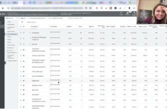
Auction statistics analysis
Now I’ll show you how to find benchmarks for the right or wrong audience. On the example of this store.
Go to auction statistics. There is a trading company. It is advisable, if there are many trading companies, to go into each one separately and analyze the statistics of auctions. You will see a different set of online stores. This is the third store. There were a lot of them, but decently. What are you looking at?
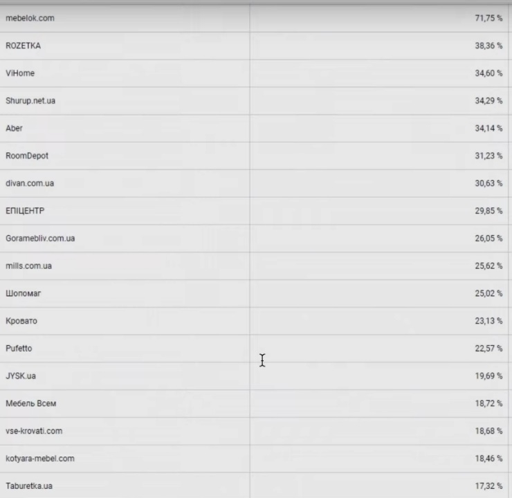
Firstly, if you are not familiar with online stores, try to analyze – they fight in the same price range, they offer the same product range, how much the product range takes, and other nuances.
It’s quite hard to understand something from Rozetka. Mebelka is also relatively hard to understand. For the rest of the sample, except, of course, the Epicenter, it is approximately clear in one or the other price segment. If you take the third online furniture store, you can see a client who took a certain percentage of impressions received, a large store. Good ratio. There are products with overlapping prices. An audience that is easier to part with money than this store. I will give the statistics of the auctions of the second case, where the price tag was as low as possible and the goal was to collect this audience, respectively, which will lead to the budget price tag.
See the statistics of the auction of the second store that had a budget product range. Not in the first issue and in the first page. There is also a page. In the cheap price tag, there are many more stores that beat. There is no longer a store here. He is practically never seen. It takes a small percentage somewhere. Even Mebelek went down a little in the percentage of impressions received. You will be guided by whether smart began to select the right audience.
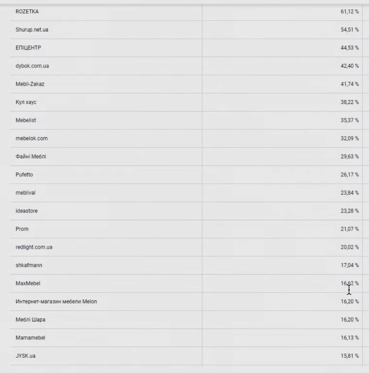
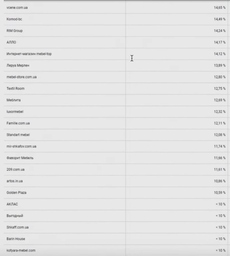
Uses dynamic remarketing statistics. If, in addition to Google shopping, there is a set of different types of traffic, targeted advertising, some kind of organic traffic, perhaps you order newsletters, CPA networks, some prosales, or something happens. This may indirectly affect the shift in the attention of the smartshopping targeting audience to another audience. It can fall in its profitability, in conversions, and so on. Track here.
The same technology can be used not only in the subject of furniture, but also in the subject of clothing. One team came and wanted to understand why their expensive sportswear on the Russian market was not converted, not sold. The first thing I did was just check the auction statistics. It turns out that they were advertised with a decent price tag for the environment of the product range conditionally up to a thousand rubles. It cannot be said that in such conditions they would sell products. An audience that googles for 1000 rubles will not physically have enough mental or financial resources to buy this product from it. Perhaps they would hoard. This money is not here and now. Remember to understand whether you are targeting the right audience directly.
Comparison of transaction rates
What do I want to point out? Conventionally, let’s look at the site conversion in transactions and separately different leads. The first store, which is the largest, we will name the largest. He is relatively large. Not very big. Transaction coefficient 0.25. He sank a little. It was a little higher, a little lower, depending on the product range that was launched. We constantly shuffled the goods among themselves in order to draw a conditionally better structure for us 0.25. Fixed, focused only on transactions.

Showing the second online store. See. The second online store with a budget price tag. Tracked more targets. First, transactions. Call back, call back. A typo was allowed. Click on the number directly. The click on the number was tracked because the client did not have additional funds to simply launch call tracking. The third store had call tracking. I’ll show you now.
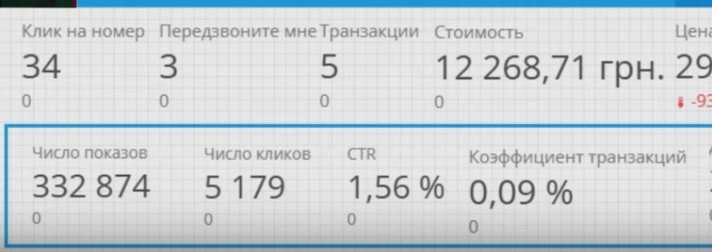
Look, if we look at him, there were only transactions and the ratio of income, expenses, respectively, profitability. A client where there were few transactions. Because they bombed the public sector audience. Average check. There is no average check here. It is expensive enough for them to transact. People called the online store to clarify the details.
Of course, we couldn’t analyze what exactly they asked the store. According to the client – one situation. After listening to the call tracking room, they would understand more approximately. Perhaps this situation could be improved. The client came just purely for a month. I will show weekly statistics on how they grew, increased the number of conversions, improved profitability. Let’s say the total statistics for the month. The transaction ratio is nine hundredths. Nine hundredths. transactions. Please, one of the important points.
The first thing is whether the right audience was selected in the auction statistics. Second, check where there are more leads. If it’s easier to convert through calls, then we connect not a click on the number, fixation, goal, but we fix the call tracking directly. We are trying to swing our automation through it.
We go to the third store – the middle one. The third store, which was more expensive than the previous one, sold only beds. Only beds. The client wanted to focus purely on the beds. They were of different sizes.

There are, of course, nuances. Show month of work. The result is an income of 200. The price per transaction is 2000 hryvnia. There are all leads. All the leads that were recorded? Transactions once, one-click purchase two, calls three and credit purchase four. Goals were agreed with the client for fixation. Of course, each of the goals had some specific value.
Call tracking was recorded in calls. Binatelovsky, if anyone is interested. The client chose call tracking Binatel. Already came with him to us. Number of leads – 91.
The goal of the client for all the KPIs he wanted is more simple clicks and, accordingly, more calls. He had little interest in transactions. interested in calls. Through calls, managers managed to tighten up, resell better, more expensive, easier. KPIs were different from the previous one. Profitability 371, in principle, given that there were more calls. The calls were given no value. Therefore, profitability looks very thin. In fact, it was much more. Orders were converted through calls. Through calls, the value was not transferred accordingly. End-to-end analytics was not connected.
We look at the transaction ratio. The ratio of conversions to the order through the cart to the number of clicks. It turns out 0.17%. Higher than the second store. Lower than the first store.
Very interesting situation. The store had in stock at the moment when it showed the result of the first store, there were several important points that I asked to add this store, which is the largest, to the product cards. What did you ask them to add?
What is recommended to add to product cards?
First, reviews. The third store had product cards filled with reviews. Moreover, these reviews were as real as possible. With photographs, with real feedback, descriptions of various nuances, the apartments were different. It was obvious that these were real reviews. They worked on this before.
How many calls and sales will I get by ordering contextual advertising from you?
I need to calculate the conversion of my website Describe
the task
in the application
Calculate potential ad revenue Google
contextual advertising calculator
Secondly, there was content, real photos. If you look, the store had well-drawn 3d models on most of the furniture products. Just photos – well-drawn 3d models on a white background.
The third store had photo content with real photos. What does the bed look like, with a lifting mechanism, without. In such-and-such an apartment, such-and-such a size. What is the actual color. White, gray, leather, suede. What does rag upholstery look like, under the skin, lifting mechanism. It was closest to the person buying without being physically at the point of the store. They do not have physical points where you can go to both stores, where you can go to feel. Or we want to sell to a region from which it is difficult to conditionally come to this physical point to see a sofa.
Epicenter has added a whole block of sofas and beds to the stores, which you can come and feel. at every physical point. And Mebelek opened several in Kyiv, opens outlets so that people come and physically feel the goods.
The more real photos of the content, in reality, what the item looks like, the higher the conversion. An addition to the store was that a video was added. On part of the commodity items, real videos were shot. Not production, cool, cool, but a real video shot by a person showing a sofa, a bed in this case.
Those are the three missing pieces. Also “Buy on credit”. As you can see, “Buy on credit” was not particularly bought. They didn’t call much. Perhaps it was bought through calls. Components that were sorely lacking at the time of work this month for the client.
Now the client has changed. It has already filled with reviews, another situation. If a large store were to initially add at least these two points without a video from the store, the conversion would become 2, or even 3 times more. I’m not exaggerating, two or three times more.
At the store, people don’t really buy through a transaction, but they call very actively to buy, clarify. The audience here is not very, fifty-fifty. Some want to buy through the order, some want to buy through the phone.
Good, relatively good, good transaction rate. Here the transaction coefficient is better than all the others. Even though it sank a little. The structure was reworked, other nuances, feeds were rewritten. Very hard with feeds.
I would add here – two or three times more would be. Unfortunately, the recommendations are implemented with a very huge delay. At first, the client goes through the stage of denial. Then it performs the necessary actions.
We enter a niche that is specific, well, not specific. Where you need to feel, look at this product to understand whether it fits, does not fit, how it looks in reality. Ikea was confused with the fact that it can directly, you can visualize your room on the site and stuff furniture there. You can see how the furniture looks like in real life. Come to the Kyiv Ikea, see what is there, just ready-made furniture sets, right through the rooms. It’s convenient enough. It’s not just Ikea doing this to fill the space in the store. It was easier to pack everything on the racks. Does as it works in conversion. People come in. They see one-two-three-four how it looks, they can buy the whole set, they can buy one unit, etc.
The task is to add reality to the photo content. Not just rendered 3d models, pixelated pictures, when you want to see the closet in detail, but you can see – the picture is not very high quality, you can’t see certain elements. Like the shelves are screwed, they are screwed by internal mechanisms, onto some kind of square, triangular little thing. It flew out of my head, as it is called, sorry. I’m completely thinking about something else.
This affects the conversion. Would add more video. Make a video in a classic format, like you used to run the “Shop on the Couch” video. Launch the young lady, who will talk very coolly for three minutes about a wonderful sofa, bed, tabletop. It works. If it didn’t work, dropshipping wouldn’t work, videos wouldn’t work in sales, in conversions. In satellite television, I personally saw entire channels “Shop on the couch.” If it didn’t work, no one would do it. I suggest adding. One of the video content ideas is to turn the store into a vending machine without the involvement of a manager. Video – sales manager 24/7.
Weekly results for the second store
What about the poorest store in terms of results, but not the poorest store in terms of sales? I want to show now. I want to show how we increased the result week by week.
Look. First week we launched. The expense part was 2000, the income was 13.731. On one transaction, it is not surprising that there was a 700 percent profitability.

Second week. Please already the number of clicks on the numbers is the best. 3100 – spent. 273 – cost per lead. Podupala. It can be seen that in the first week there were 6071.
We earned 5 thousand. Although there was one transaction. The conversion dropped. Profitability 304. Increased in clicks on the number. Clicks on the number, we still do not record calls from PC computers. This is a click on the number when mobile results are clicked.

Third Thursday, please. Fourth week. Look, the expenditure part is 3100. It has conditionally grown by a small percentage. What to do? Rewrote, re-riveted the feed. Our guys work more on the quality of feeds than on any other tasks or on bid adjustments.
The feed has been rewritten, the strategy has been redirected. Reorganized product range. Please, a picture of what happens. Already two transactions. Not one, but two. The number of clicks on the number has grown. The ones that are fixed. In reality, there were more.
Please, the profitability is 500. There are already 12 leads. The price per lead is 300 UAH. Transaction price. The transaction rate has grown. Transactions have dipped in recent weeks. The transaction coefficient dipped. There were, well, a little relatively more leads. We tried to increase the advertising budget. Apparently, conditionally for a thousand hryvnia. Profitability hasn’t dropped much. The result is this. The number of calls has grown. The client had the task of doing everything to the maximum. We tried to do the maximum within these weeks, which were enough.

Why couldn’t it have been done faster? If we rewrite the feed that is in the Merchant center, the system takes conditionally more active targeting, according to personal observations, a week after making changes.
I think this is due to the fact that it moderates conditionally for a free issue of a change, conditionally for a week. I notice that as soon as they made a global piece of changes. Only a week later, the system, despite the fact that everything is approved, moderated, begins to take it actively conditionally in a week to the shows. We only had four weeks.
Moreover, constant work with the feed in the process, which we managed to achieve, approximately, such a result. What is the store missing? What if the first and second?
Suggestions for improving the second store
Firstly, there was no fixation of call tracking. Perhaps there would be many more calls here. Plus, they would listen to the call tracking room. We would understand what exactly people are interested in on the site.
Perhaps, they would conditionally prescribe the cost of delivery for free from some cost or conditionally send a cash on delivery, etc. What people may be interested in, online stores do not always prescribe product cards.
Plus the pictures, unfortunately, were photo content of the 3d model. There were product cards with a relatively good set of photos. This is something primitive, conditional. Not like the third store with its photo-filled content.
A person when he enters. Take the place of a person who urgently needs to buy a wardrobe. We measured the place for the closet, conditionally want to buy a bed with a lifting mechanism or not with a lifting mechanism. First, it will be of interest whether the lifting mechanism is reliable. Many will write on the site – Reliable lifting mechanism.
When I was a student, I came across such a bed. There were metal things bent in it, lifting the bed up. They bent over. Because of the breakage had to press on the bed to close. I did not regularly use the lifting mechanism. Of course, everything can fail, from a working state.
Then, see how the skin looks. Maybe a thin leatherette, which will be scratched, if you hook it with something, everything will tear, it will become unusable. What does suede look like. The picture is one thing, the reality is another. Everyone has experienced this.
For many people, giving a certain check is a fairly large amount of salary, conditionally not from a salary. They wanted to see, feel, these products in order to understand whether they like it or not. By the same logic, Rozetka would not make showrooms. I wouldn’t make Citrus showrooms where you can come to touch the equipment, see it, like it, don’t like it. Another concept like this.
Summary. What needs to be improved on the websites of the three stores
To summarize, take to analyze three stores, conditionally three stores, to understand what each one needs to learn for the theme of furniture. First, you know that most conversions are made through calls – connect Binatel or better Ringostat call tracking.
For what? To track the actual number of calls and the ability for a specialist to listen to calls. To understand what to improve on the site in landing conversion, how to rewrite the feed. Believe me, when you listen to calls – a huge piece of ideas appears.
Perhaps people just call and ask if there is a showroom, if you work on such and such a schedule, etc. You understand that the advertising channel does not work. The challenge is to connect. If the task is to focus only on transactions, as in the first store, then the product card should be licked as much as possible so that there is less question from the client – it’s worth buying, not worth it. In the visual appearance of the store – credible or not. This is a very nice visual. Caused, a priori, more confidence in the store, unlike the other two stores.
Third. Add more real photo content. How does a set of finished furniture in the bedroom look like in reality, how does a dining table, a bed, a conditional sofa, etc. look like. Add more photo content. Add reviews to the landing page. Go to Rozetka for reviews. Not everyone buys at Rozetka. If they bought only in Rozetka, then of course the rest of the stores would not participate in the auction statistics.
When viewing auction statistics, some advertisers have a huge amount. It happens that hundreds of competitors sit in the statistics of auctions. They go to Rozetka for reviews, look at real photos. The socket encourages people to leave videos, photos, etc. Take the place of the client, try to analyze and evaluate in the same format.
What do we do? We fill with real photo content, reviews. It is advisable to provoke people to leave direct photos. It’s even better.
Fifth. Try to make video content. At least to the top commodity items. Just go to the warehouse, put the camera in, just start taking pictures of how it looks, the chips, what a good mount, it doesn’t hang out, what it’s made of, chipboard, etc. People will actually watch. It doesn’t seem to matter, but people will watch. The more there will be a simple answer why, what to buy, why to buy, here and now – they will buy. There is no way to bother if there are financial resources for production – make conditional sales “Shop on the couch”.
Sit a guy, a girl, who will describe in colorful words how wonderful the sofa is. Surprised, but it works. It would seem that they suck the advantage straight out of the finger. It works guys.
I can recommend it. If combined, put each. Put together – good design, good store branding, reviews, good described cards, optimization, purchase conditions, etc. Everyone from the stores could receive very impressive turnover and receipts, respectively.
I hope that the comparison of the three cases gave a hint where to dig, improve the store in order to get more sales. There are questions left – I’m waiting below, in the comments.

