- How to properly prepare the site for the launch of an advertising campaign?
- The site’s first screen
- Adaptation for smartphones
- Online analytics systems
- Thank You Page
- Goal Value
- Number of fields in the order form
- Contact form performance
- Menu Navigation
- Company Information
- Prices
- Product photos
- Payment and delivery
- Contact information
- Call Tracking
In order for contextual advertising to be effective, first of all, a competent campaign setup and sufficient funding are required. However, not only these criteria affect whether the advertiser will like the final result.
Technical errors, incorrect work of the site and, as a result, the loss of potential buyers cost the business more and more. Competition in the online space is constantly growing, the cost of attracting a client in certain areas of activity exceeds several tens, and sometimes even hundreds of dollars. At the same time, the requirements of the audience are being tightened. Visitors quickly switch to a competitor’s site if the checkout process is more convenient there.
If the question of how to prepare the site for the launch of contextual advertising is relevant for you, then carefully read this article. This is a kind of checklist, using which you can audit a web resource for the most common errors. They are usually expensive for company owners.
How many calls and sales will I get by ordering contextual advertising from you?
I need to calculate the conversion of my website Describe
the task
in the application
Calculate potential ad revenue Google
contextual advertising calculator
How to properly prepare the site for the launch of an advertising campaign?
Remember – a bad site will not allow you to get a good return on your advertising investment. But creating a new one is expensive and time consuming. Therefore, it is wiser to increase the conversion on an existing resource by modifying it in accordance with the recommendations listed below. In this case, in order to properly prepare the site for the launch of an advertising campaign, you will only have to spend money on paying for a few days of work by a specialist.
The site’s first screen
Convey your offer in such a way that its essence is clear to the visitor after 3-5 seconds of getting to know the content located on the first screen. Don’t be scattered, talk about the main thing and consistently promote the user to the target action – placing an order, calling or applying through an online form.
For example, if you sell stretch ceilings and the target action is to provide contact information to call a measurer, then you should not show a block with articles about ceilings to a potential client. It will also not be effective to offer him to subscribe to the mailing list of promotional offers. The larger list of possible actions you provide to the user, the more difficult it will be for him to make a choice.
In the process of preparing the site for the launch of advertising, ask several people to evaluate the resource. Find out if they understand the structure and content of the site, what exactly motivates or demotivates them to take a targeted action. For an objective assessment, it is better to interview representatives of the target audience or third-party people, and not your acquaintances or employees, who are unlikely to be able to accurately and honestly formulate their opinion.
Adaptation for smartphones
Practically all online resources today record traffic from mobile devices. In some niches, it keeps within half of the total volume of visits. And in some areas (for example, ordering tickets or taxis) it reaches 80-90%. If your site template was created recently, then most likely it is adapted to all types of devices. But still, we recommend that you make sure that the layout is correct using the following markers:
- edges of images do not go off screen;
- active interface elements (buttons, links, etc.), as well as headings are displayed in their entirety – horizontal scrolling is not required;
- the font is large enough that you don’t need to strain your eyes to read it;
- site elements do not adjoin and do not intersect each other, it is not difficult to get into the desired area of the screen with your finger.
Advice! To check how the site is displayed on different types of devices, there is no need to have them all at hand. You can use one of the convenient online services specially designed for this.
In addition, you should test the site loading speed. Google Speed Test will help you evaluate this parameter and also provide recommendations for improving it.
Online analytics systems
You can’t improve what you can’t measure. You can evaluate the effectiveness of contextual advertising using special analytical services. They record indicators of the behavior of visitors on the site: the time spent, the sequence of pages viewed, the completion of a targeted action, etc.
Important! Ensure the collection of statistical data even before the launch of an advertising campaign, so that during its subsequent optimization you will have complete and correct analytics.
Install the Google Analytics code on your website pages, link it to your ad account, and set goals. If all actions are performed correctly, the analytics service will independently record information about the effectiveness of advertising.
Thank You Page
Acting blindly is the worst case scenario for online promotion. It is necessary to constantly monitor the number of hits received from the site in relation to traffic sources and campaigns. The easiest method is to set goals in Analytics.
As a goal, you can set the user to hit the “Thank you” page at the end of the checkout. If such a redirect is already set up, then you will not need to involve a programmer to create a goal. Settings can be made by a marketing specialist or business owner in just a few minutes.
Goal Value
As a rule, advertisers evaluate any marketing activity not by the number of transactions made, but by the cash flow they generated. Calculate the average profit per customer, adjust it for the conversion rate of your sales managers processing leads, and you will receive a predicted income from one application on the site.
Enter this value into the analytics system so that the reports show not only the number of hits, but also the expected income from them.
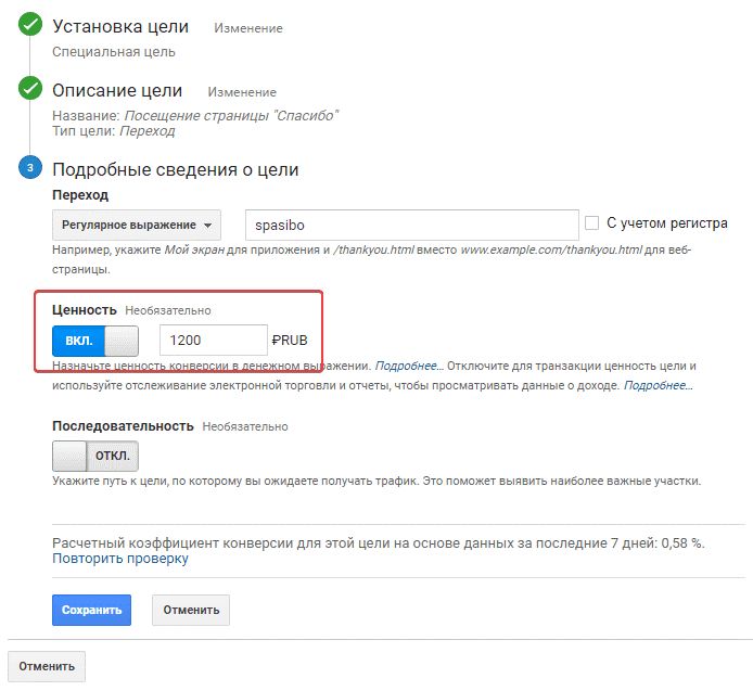
In the “View” module in the Analytics settings, click on the “Goals” link:
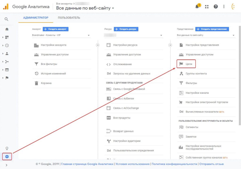
Set a goal, then in the Goal Details section, move the Value slider to ON. and enter the value of the projected income from one application:
Number of fields in the order form
After spending time selecting a product and searching for an online store, the buyer often encounters difficulties when placing an order. Sometimes these difficulties are created by the business owners themselves, offering to fill out, for example, such a large form:
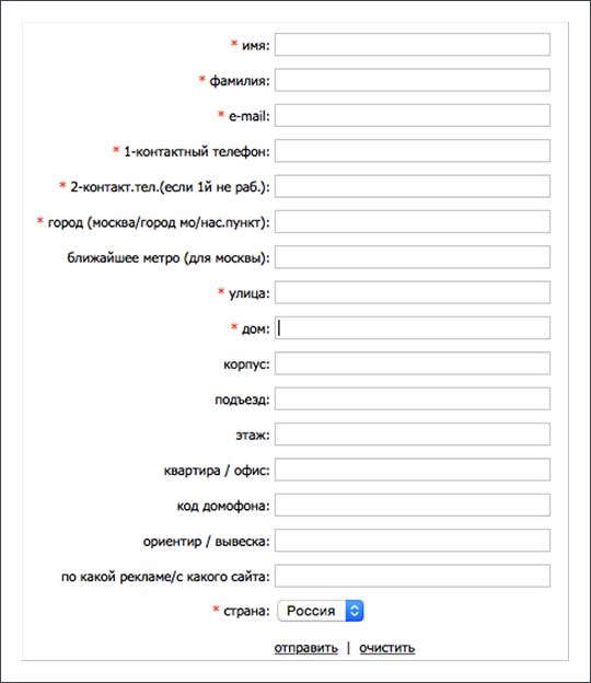
Most likely, a potential buyer will prefer a competitor’s website, where you only need to enter your name and phone number when ordering, and the manager will clarify all the information required for delivery during the call.
How many calls and sales will I get by ordering contextual advertising from you?
I need to calculate the conversion of my website Describe
the task
in the application
Calculate potential ad revenue Google
contextual advertising calculator
Advice! Shorten the application form on the site, leave only those fields that you cannot do without. Find out additional data in the process of communication with the client.
By removing unnecessary items from the order form, you will reduce the percentage of refusals from the purchase halfway through. And such situations happen very often. On some sites with a long list of fields, the percentage of opt-outs is as high as 70%.
Contact form performance
Sometimes, entrepreneurs are unaware of the presence of errors in the operation of some elements of their site. The situation becomes critical when it comes to the “Order a callback” or “Place an order” buttons.
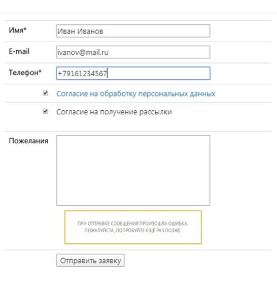
In some cases, this can be seen in the messages that pop up when trying to submit a completed form. But sometimes the user sees the standard “Thank you for the order, the manager will contact you”, but the information does not reach this very manager.
There may be several reasons: the e-mail is incorrectly specified for sending order data, the script works with errors, letters arrive but are automatically filtered to the Spam folder, the ability to send letters is disabled on the hosting.
Important! Before launching an advertising campaign, check the performance of all elements of the site. Check whether you receive letters with information about the order, and how correct this information is.
Menu Navigation
In whatever section of the site the visitor is, he should have a clear understanding of how to go to the desired page. For this purpose, a menu consisting of several groups of elements is made in the header of a web resource. All these elements, as well as groups, should have clear names and a logical structure.
Company Information
The page about the company must be present on the site and be accessible from any section of it. It must contain truthful information about the history of development, post photos of employees, office or production facilities. If there are eminent clients among your buyers, then their recommendations should be published on the page about the company.
Advice! Feel free to show off your achievements. Talk about them, showing real numbers. Publish diplomas, certificates and awards. The client should know how cool you are!
A visitor to an online store should not doubt that the company has sufficient authority to solve his problem qualitatively.
Prices
One of the key criteria for making a purchase decision in most areas is the price. Other things being equal, the client will place an order in the online store where the price of the goods is published, and close the site without a price.
If the cost is formed by complex calculations or information from the buyer is required to calculate it, then indicate the lower limit of the price range (for example, “from $ 100”) or place a small questionnaire form on the site with the call “Calculate the cost online”.
Product photos
The subconscious perception of the site by visitors is most influenced by its visual range. When making virtual purchases, the consumer cannot touch the product, so he relies only on the visual representation.
Photos of unsatisfactory quality – darkened, blurry, non-obvious – cast doubt on the merits of the product itself. In such a situation, a potential client goes to competitors who have professional product images on their website.
Payment and delivery
After the visitor selects the right product, he will ask himself the question “How to buy it?”. Answer it in the product card or highlight the information in a separate menu section. Enter the maximum number of possible payment methods.
Information about shipping options should be prominent. After all, a convenient service motivates the visitor to make a choice in favor of your online store.
Contact information
Place your contact information on the right side of the site header. They should be large and easy to read. Here you can enter both a phone number and the address of the point of sale, if necessary in your field of activity.
Optionally, create a separate Contacts menu section. On the appropriate page, publish all phone numbers, addresses of representative offices and offices, links to instant messengers and social networks, and a map.
Call Tracking
Not everyone who comes to you through an advertisement uses the application form. Some habitually pick up the phone and make a call to the number indicated in the contact details.
If this number is used when promoting through other channels, then it will be difficult to evaluate the effectiveness of each traffic source. You will have to ask the client a question about how he learned about you. It is difficult to get 100% reliable information in this way.
You can solve the problem by using the Call tracking tool. The principle of its operation is as follows: the code installed on the site shows different phone numbers to visitors who come from different sources.
Call tracking services offer phone numbers from 100 UAH, some of them have a free trial period. There are many companies on the market that provide this service. In addition to renting a virtual phone and detailed statistics, Call-tracking services additionally:
- Recording conversations for a rented room.
- Fix the duration of waiting for the manager’s response.
- Copy call information to CRM system.
- Suggest numbers for multiple carriers.
- Provide a wide range of analytical functionality to increase sales efficiency.


