Customizing Google Data Studio: a complete guide
Google Data Studio is a free tool that makes it easy to monitor your website traffic, traffic, user behavior and other KPIs. It allows you to quickly generate reports for the client or for data visualization in team work.
The functionality of the service is so broad that at the stage of familiarization with it, the interface may seem too complicated. From our article, written especially for Internet marketers and contextologists, you will learn how to customize Google Data Studio and start controlling all key business indicators in the interface of one tool.
What is Google Data Studio?
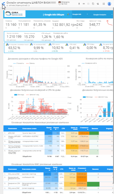
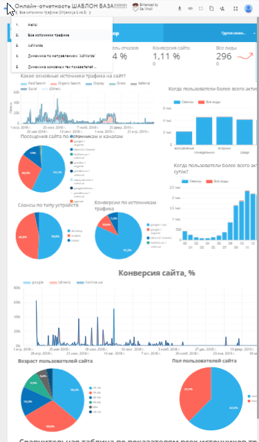
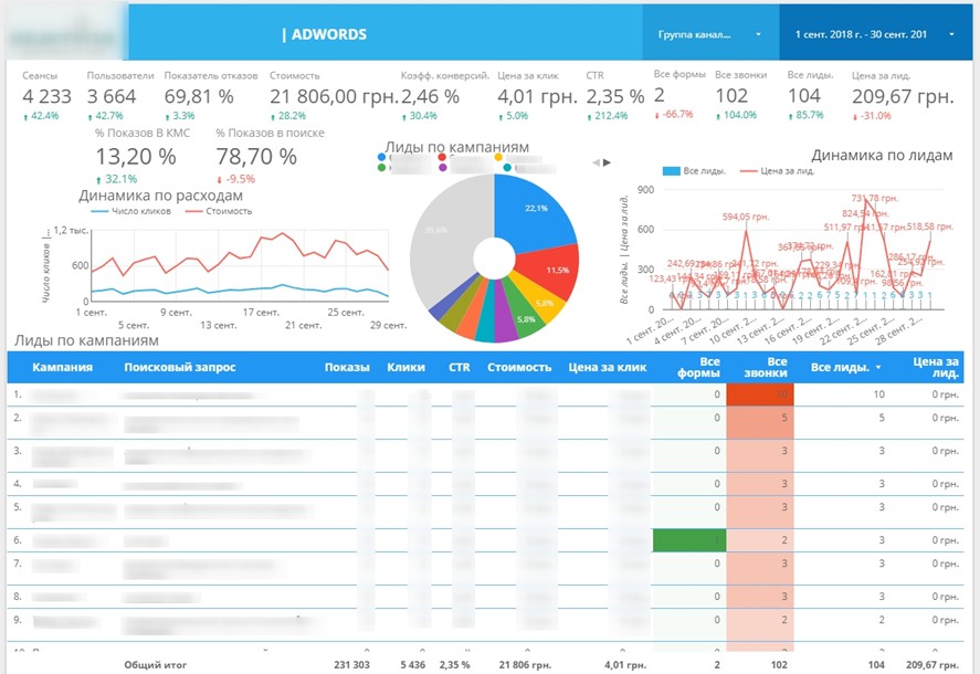
Google Data Studio is a service for quick and convenient creation of informative reports and dashboards, including interactive graphical and tabular forms. Consumers of such statistical information are both narrow specialists in the field of Internet advertising, analysts and developers, as well as managers of various levels, and business owners.
Statistics is presented in an easy-to-analyze form. Joint one-time access for all team members is also provided.
Tip! With the help of this tool you can monitor key project indicators, identify trends, build further strategy, etc.
The service’s algorithms aggregate data from several sources – social networks, Google Analytics and Tables, CRM-system databases and so on. Such integration allows you to automatically update all collected information.
Features of the Google Data Studio analytics system
Setting up analytics in Google Data Studio allows you to access without much specialized knowledge:
- Control and analysis tools. Analytics allows you to monitor the behavior of site visitors and promptly make adjustments in case of identified problems.
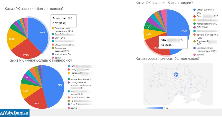
- Operational monitoring of advertising campaign performance. The application makes it possible to evaluate the performance of each marketing channel, which allows you to reallocate resources to the most effective and promising of them.
- Effective audience segmentation. Select from the general mass only those users who are really interested in the product and focus the main budget of the advertising campaign on them.
- Information about which of the traffic sources is the most effective. Thus, you can abandon unprofitable advertising channels and reallocate funds in favor of working ones.
Benefits of reporting in Data Studio
- You can customize data sharing with over 800 sources as well as 340 connectors. Google and end-to-end analytics services, social media advertising accounts, and CRM databases can be easily integrated with Data Studio.
- Minimal time spent on creating reports. The ability to choose the most suitable one from dozens of ready-made templates greatly simplifies the process of reporting in Google Data Studio.
- The system implements the function of custom reports generation. You can collect information from various sources and display them on one dashboard.
- All the tools of the service are free of charge. Alternative options with comparable functionality will cost you at least $50 monthly.
When does a business need to order Data Studio customization?
It should be noted that you can connect this tool yourself if you work with a single advertising platform.
However, in case you use several different Google advertising tools in your advertising campaign, targeted ads Facebook or Instagram, call-tracking, online chats and actively use CRM system in your work – then the services of professionals you just need, as the setup in this case will be quite complex.
It is necessary to order customization of Google Data Studio if:
- The goals of the advertising campaign are precisely defined – the service brings the best results if it is used in an advertising campaign, the ultimate goals of which are well known;
- You want to base your advertising budgets on real data (conversions, information about the profitability of various advertising channels, target audience portraits);
- You want to improve the efficiency of existing advertising campaigns;
- Existing analytics systems do not display all the desired data or you need to combine information from different sources in one convenient tool.
The cost of Data Studio customization starts at $200. The time frame is 10 business days.
Guidelines for customizing reporting in Google Data Studio
The GDS user interface is intuitive. But this does not exclude the possibility of problems at the initial stage, when you try to link the service with information sources. Let’s consider this issue below, as well as provide recommendations on customizing reports in Google Data Studio, choosing a style and template, instructions on adding charts and building graphs.
Authorization
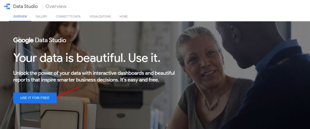
Download the Data Studio home page at the URL https://datastudio.google.com/overview. Use your Google account login and password to log in:
The main menu will appear in front of you. It does not yet contain the necessary items, but by following our instructions you will soon be able to add reports, sources and workspaces.
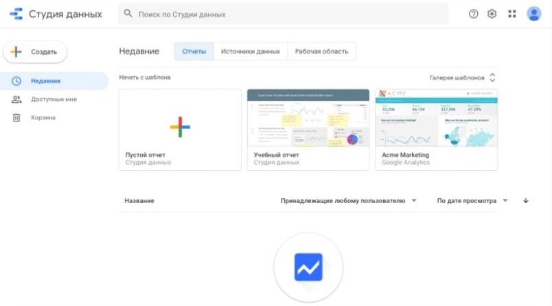
Next, click on one of the two modules marked with a “+” sign. The first one contains the “Create” link, and the second one is called “Empty Report”. If you have not previously worked with Data Studio under your current login, the system will prompt you to agree to the service rules and subscribe to the newsletter.
Use the “Get Started” link and accept the terms of use.
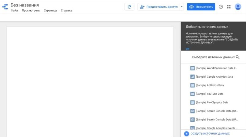
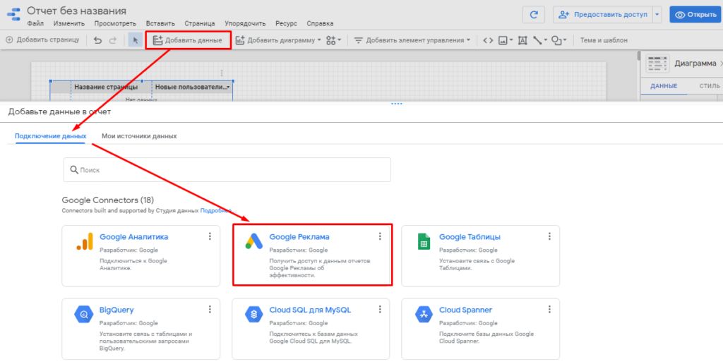
After clicking on “Finish”, go back to creating the report. A blank template will appear where you have to define the data sources.
A list of current sources is displayed on the right side of the screen. Since you do not have any selected options yet, the system will first of all recommend test sets, which are marked as “[Sample]”:
Connecting data sources
In GDS, the data source is a piece of information collected by third-party services. For example, when using Google Tables, this source will be each individual sheet.
According to the Google Data Studio manual, sources are connected both in the process of setting up a new report and when you go to the same-named section of the main menu:
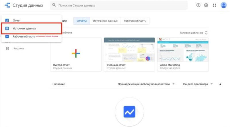
Select the module of the required service, integrate it with your account and set the required source. Then click on the “Link” link:
Once you link a source to GDS, you can later use its data without re-integrating it.
Customizing Data Studio design theme
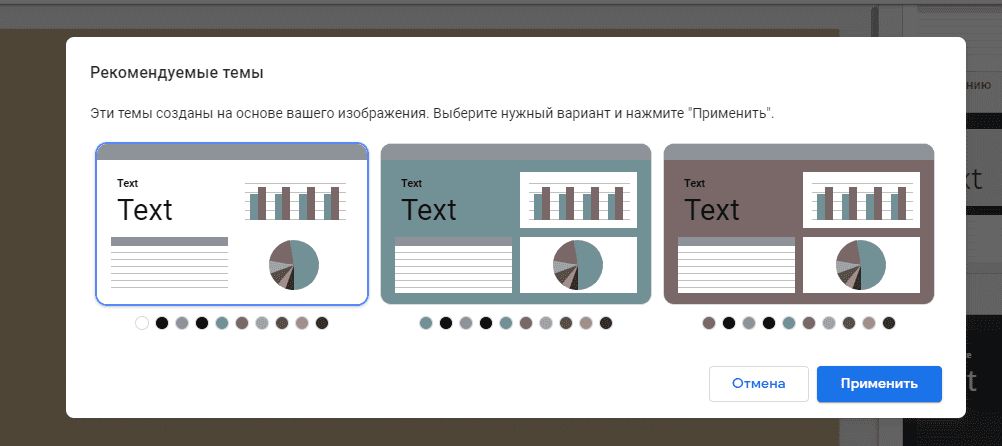
In the “Themes” section, you can set the design of reports by selecting the one you like the most from the ready-made variants. In the same tab you can upload your own images, based on the color scheme of which the algorithms will then create several templates with personal design:
Any of the proposed themes can be modified by clicking on the “Customize” link located near the name of the selected theme:
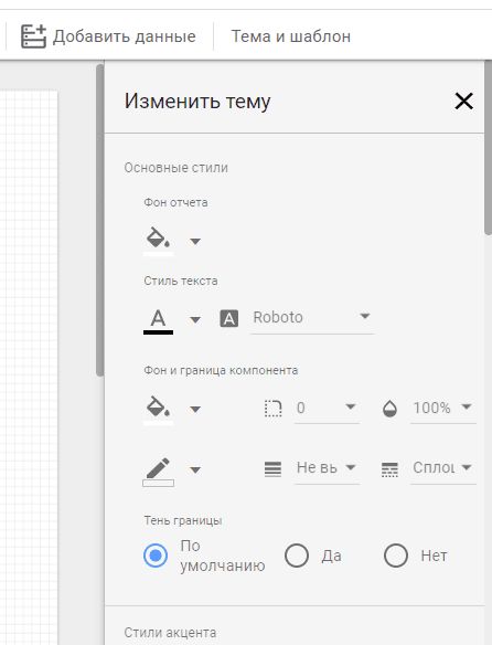
The report display parameters are set in the adjacent “Layout” block. In the standard variant it is a horizontally oriented page with a resolution of 1200×900 pixels. But this format is not convenient for every situation. You can change the settings in the “Canvas Size” field:

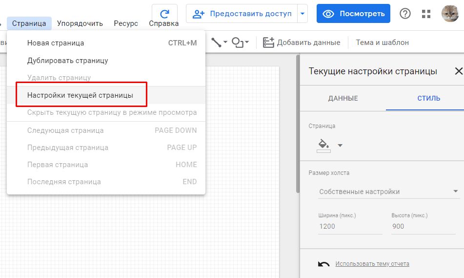
To make any page different from others, use the “Current Page Settings” subsection in the “Page” section:
Selecting metrics to build the report
The list of metrics used in the report is set in the right part of the Google Data Studio interface:
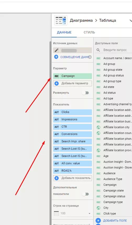
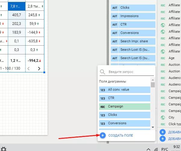
The system offers to use ready-made options or customize your own. GDS developers have provided for the possibility of creating new calculated fields, on the basis of which additional parameters and criteria are formed.
Formulas, comparison operators, analysis functions and text fragment modification can be used in calculation algorithms. Their use in diagrams and tables does not differ from the use of standard variants. You can also change the name of any field.
Click on the “+” in the “Data” block to create a new calculated field:
Defining the time period
Next, you should set the boundaries of the time period to be analyzed. This can be done either for each report or for a separate pane. Proceed as follows: open “Add Controls” in the top pane, then click on “Date Range”:
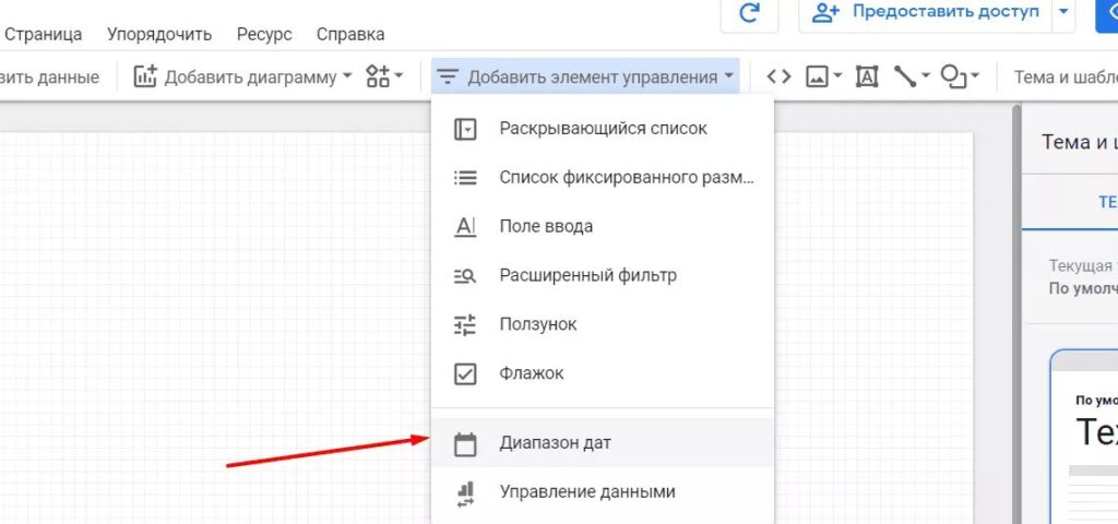
Select the required data to compare the criteria values of the current period and similar previous period.
Embedding tables
To present information in a tabular format, the system offers three options: graphical interpretation of numerical values, heat map or familiar figures:
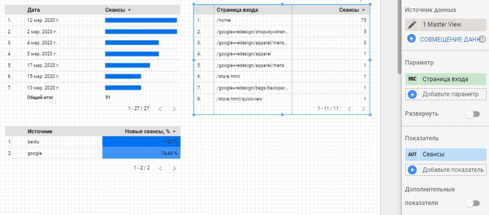
Going to “Item Data”, you can change the number of displayed rows, define the sorting order and set the output line of the results.
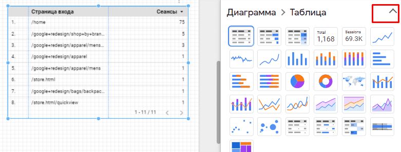
If necessary, change the table type in the settings:
Add graphs and charts
To draw a chart in Data Studio, open the Add Chart module. A list with all possible variants of graphical representation of data will appear on the screen.
For example, we have a task to demonstrate the dynamics of a variable change. We will focus on dynamic series, but later you can change the output format to any more familiar to you histogram.
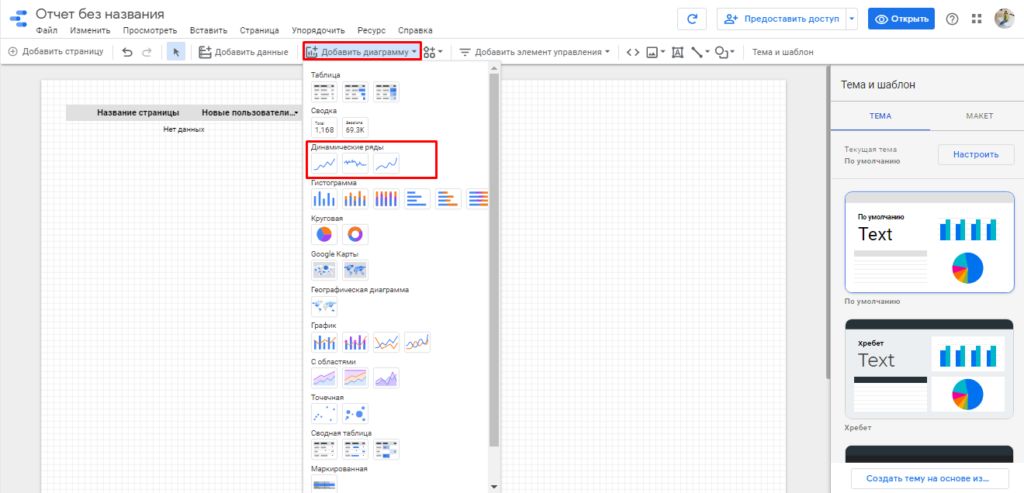
Transfer the selected chart type to the worksheet with the mouse and move it to any part of the page.
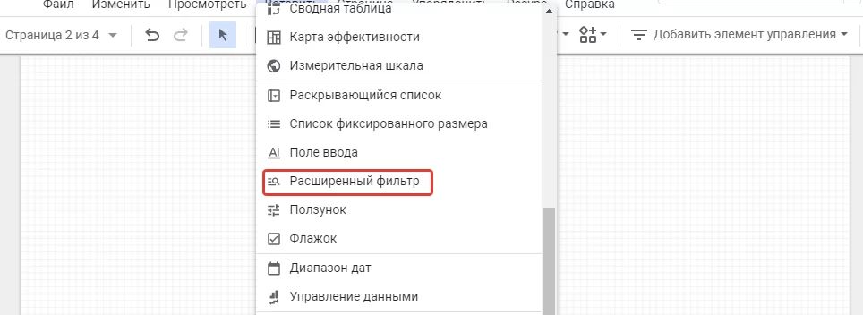
Using filters
Filters allow you to limit the data output according to a given condition. They should be used if, for example, you need to analyze referral traffic that was not generated by certain domains, or evaluate parameters that reflect the situation only in a given region.
To customize filtering, use the menu where you need to select the “Advanced Filter” item:
Define a field for the item that will be used to sort the data:
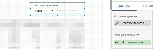
You can create a new filter in a special constructor. The process is quite simple. Enter the name, select the source, define what data you will use, and set the criterion for filtering.
Sampling parameters can be combined with each other in any variations using logical operators “and” and “or”. For each item we can use several filters at the same time. If necessary, copy, edit or delete a selection. You also have the option to use segmentation while working with Google Analytics.
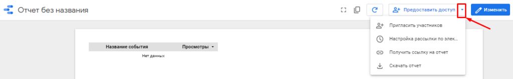
How do I export a report from Data Studio?
You can open any report in GDS for partners, clients or colleagues to view. There are several ways to do this. Click on the “Grant Access” link to use the submenu.
Determine which option is the most preferable for you:
If there is no need to adjust the list of provided options, it is sufficient to grant access to the report via the link.
To do this, go to the Access Control section and set the appropriate rule. For example, allow all those who have a link to view the report.
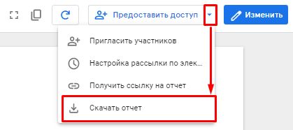
Any analytical report can be saved as a .pdf file by clicking on “Download Report” in the “Provide Access” section mentioned earlier.
Set the required parameters and click on “Download”:
Tips for setting up analytics in Google Data Studio
When customizing Data Studio, there is a possibility of encountering some problems due to the technical characteristics of the system. Here are some tips to avoid most of them:
- Do not disperse reports across multiple accounts. This is especially true for personal accounts of company employees. After all, if such an employee is fired or on vacation, you may lose access to the customized reports.
- Test connectors. To evaluate the correctness of their operation, analyze the data for test time intervals. It is important to check whether the information in the source matches the data displayed on the dashboard.
- Do not forget about preventive maintenance of connectors. Services are updated from time to time, and some of these updates may affect the correctness of information display in tables and graphs. Therefore, we recommend that you monitor connectors at least once a month.
- Do not upload images by URL. Often such images are displayed incorrectly or not at all on the dashboard.
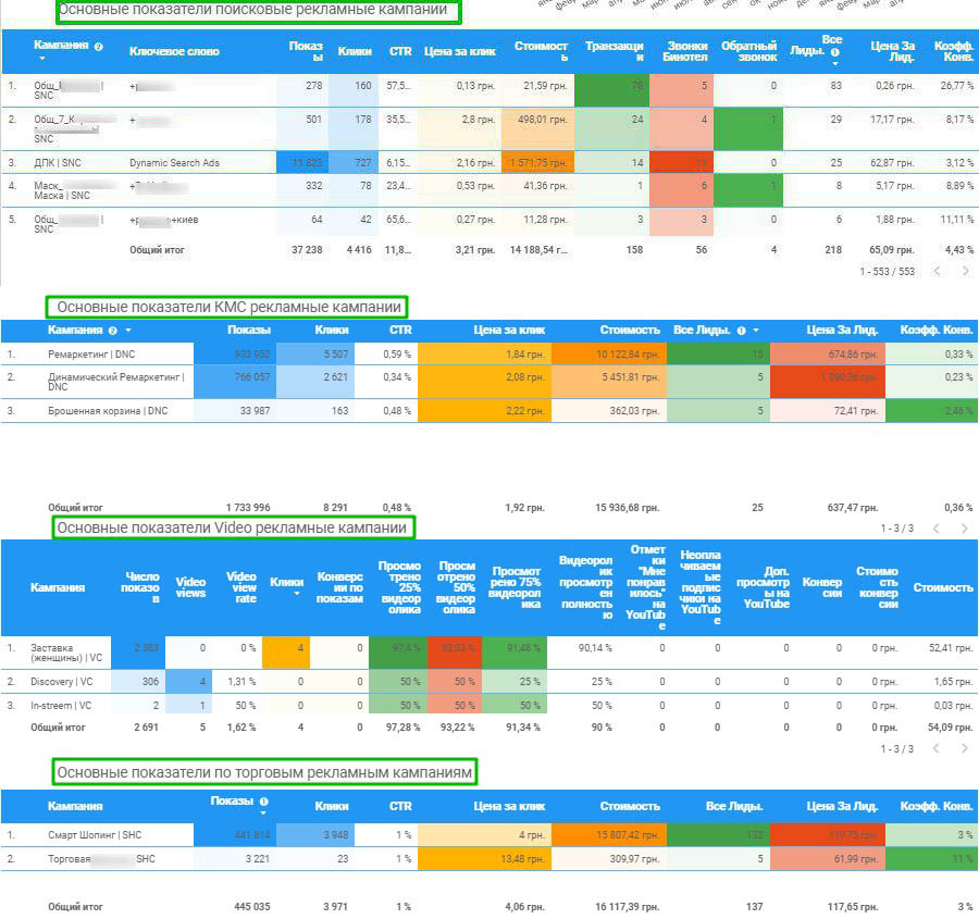
- Always accompany graphical information with a textual explanation. The data must be understandable for other users.